10 Gorgeous Design Ideas To Steal For A Stylish, Contemporary Home
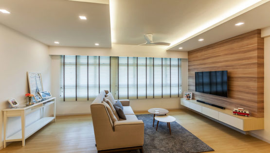
There is no interior design style more open-ended than the contemporary design. By definition, it is a style that reflects the design trends of the present day, but it does have some fundamental characteristics including strong and clean lines, classic hues, and minimal furnishings. The contemporary home is bright, open and well-ventilated; it is elegant and sophisticated, without discounting comfort and convenience.
If the contemporary style is for you, here are 10 ideas to help you get started.
1. USE A SOOTHING PALETTE OF NEUTRALS
If there is a less defined term, it’s ‘neutrals’. What does neutrals even mean? For contemporary design, think basics like white, black and brown, as well as their in-betweens like taupe, beige, cream and grey. But you can play it up with a sophisticated hue like navy or maroon. A monochrome palette is stark, stylish and oh-so-current, but if you want to create a cosy, warm atmosphere, we recommend going for earthy and wood tones.

2. A GLOSSY SHEEN SAYS SLEEK AND CHIC
Sure, matte is cool. But it can appear a little flat. Glossy surfaces on the other hand reflect light, helping to brighten up space considerably. The other advantage of having reflective surfaces is their easy maintenance, which is particularly important in a hardworking space like the kitchen.
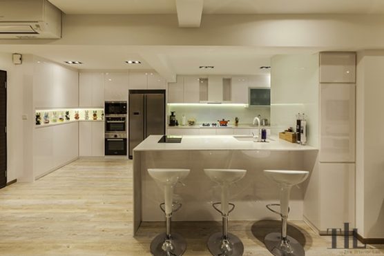
3. ADOPT SIMPLE LINES
When it comes to contemporary designs, think strong, angular lines that function as a design elements. The lines are usually kept simple and can be part of geometric shapes or other basic forms.
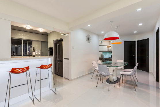
4. NEUTRALS DOSEN'T MEAN YOU HAVE TO BE BORING
While neutrals are great, there’s always room for manoeuvre in such an indeterminate style like contemporary. So, make room for bright pops of colours! Here, the all-white space features splashes of red and orange that immediately add personality and sass.
5. DRAW VISUAL HEIGHT TO THE ROOM
A contemporary home is all about open, expansive spaces. While that is sometimes difficult to achieve in a small HDB apartment, there are ways around it. For instance, an indented ceiling draws attention to the top, which invariably lengthens the height of the space. Another way is to go for full-height feature walls that lead your eyes upwards.
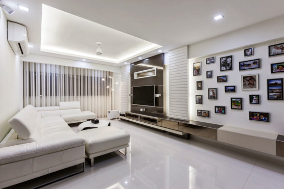
6. MIRROS CREATE ELEGANCE AND A SENSE OF SPACE
Ah, mirrors; one of the most versatile furnishings that come with a host benefits when you use them in your home. Not only are they are an elegant addition, they can also help to make your space appear larger. For even more space-saving ingenuity, use mirrors as your cabinet fronts.
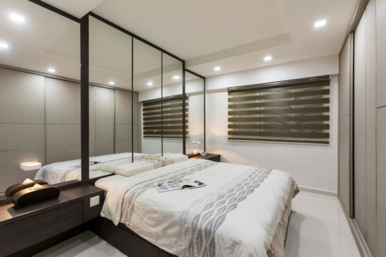
7. KEEP IT OPEN WITH GLASS WALLS
Glass is a very contemporary material, so incorporate them if you can! Glass walls are one of the best ways to use this material. They give the illusion of openness while still retaining some privacy, and they can brighten up dark corners of the house where daylight cannot reach.
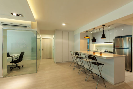
8. DON'T OVERDECORATE
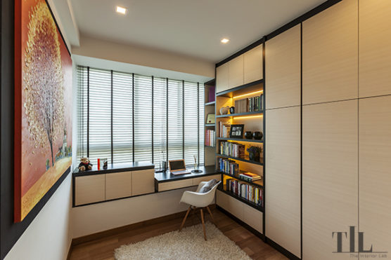
Maximalist, this is probably not the style for you as the contemporary design is all about keeping furnishings to a minimum. So no frills and loud prints please. Here, less is always more. But it’s not about having a completely bare room that is devoid of personality; rather, it’s about making tasteful choices. Opt for sentimental mementos, or decor pieces that have simple, clean forms and shapes.
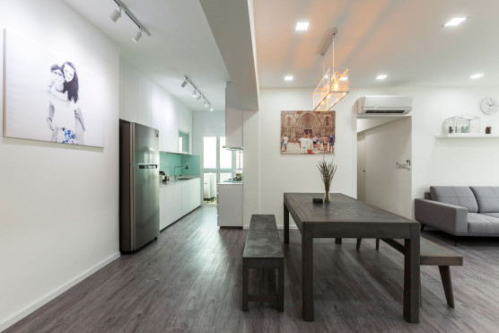
9. SOFTEN THINGS UP WITH A RUG
While a rug would almost veer into the maximalist camp, a good-looking one that isn’t too flamboyant can still find its place in a contemporary setting. We think a textured carpet with a soothing hue like cream can help to soften things up. If you’re not big on rugs, a cushion and throw would do as well too.
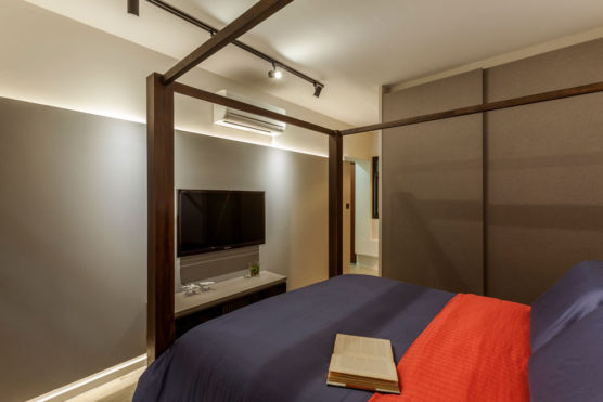
10. GO OFF WITH A BANG
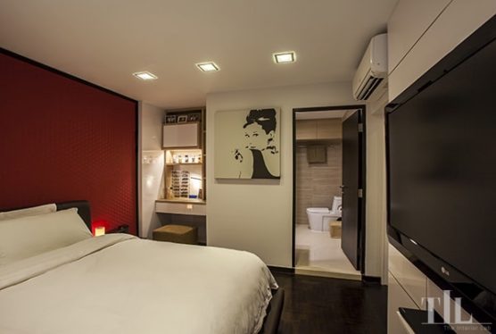
Contemporary doesn’t mean you have to play it safe. Go for a bold colour like this angry red, which stands out in this black-and-white boudoir. Black accent lines ensure that the room is still very much current and stylish.
CONSULT OUR DESIGNER
- 11 April 2025 TIPS & GUIDES
Wet and Dry Kitchens in Singapore Homes: What Are They And Do You Need Both?
- 8 April 2025 TIPS & GUIDES
How to Mix Scandinavian & Asian Elements for a Unique Look
- 8 April 2025 TIPS & GUIDES
The Golden Ratio in Interior Design: Balance Your Singapore Home
- 8 April 2025 TIPS & GUIDES
Transform Your HDB with Modern Luxury Interior Design
- 8 April 2025 TIPS & GUIDES
How to Blend Traditional Elegance with Modern Luxury Design
- 28 March 2025 TIPS & GUIDES
Biophilic Interior Design: Beyond The Aesthetics


 BACK TO BLOG