3 Common Interior Design Dilemmas Faced By Homeowners
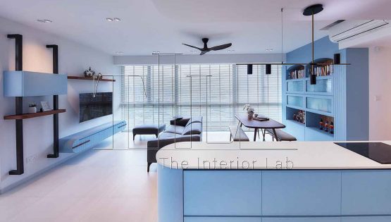
Lighten your renovation woes with the following design solutions.
Are you a homeowner who is collecting your keys to your new house soon? What are some renovation woes you are facing? Do they overlap with the common conundrum which most first-time homeowner faces? We have gathered feedback from our existing clients and interior designers to share their 3 common interior design dilemmas and their respective design solutions!
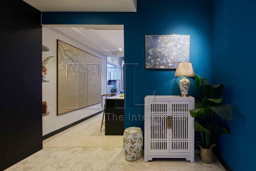
1. CONTRASTING VIEWS ON INTERIOR DESIGN THEME
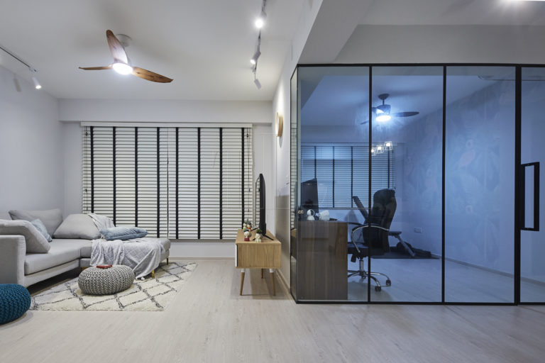
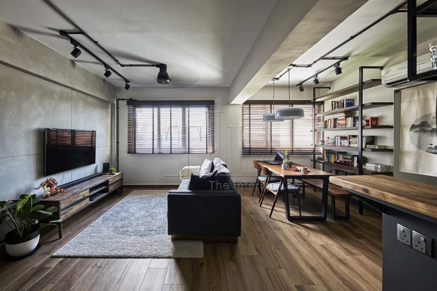
Meeting homeowners with entirely different themes in mind is not uncommon. “While my husband wanted to incorporate industrial elements into the overall design of the home. I very much love to have a brighter, cozier Scandinavian home” says Jeslynn (homeowner). When dealing with clients with polarising views with regards to interior design preferences, our interior designer would usually ask the homeowners to choose a general interior theme while incorporating key elements of the contrasting design style in a tasteful manner.
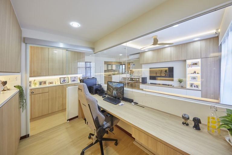
Upon discussion with Jeslynn and her husband, they eventually agreed to opt for a Scandinavian theme while weaving in modern industrial elements. The result is a neutral-muted palette along with a home office that is segregated with black-framed glass.
2. INTERIOR PLAN LAYOUT - OPEN, SEMI-OPEN OR CLOSE
With an open interior plan gaining its popularity, many homeowners usually request that as part of their design brief. However, a piece of heartfelt advice from our interior designers is that one should not blindly follow the open-interior trend. Despite enhancing the visual flow of space which makes absolute sense in the context of small apartments in Singapore, one’s lifestyle might not suit the layout. For instance, for heavy cookers, the open-concept kitchen might not be a feasible idea considering the maintenance of the grim and grease of cooking. It might also be less wallet-friendly if the hacking of walls is required.
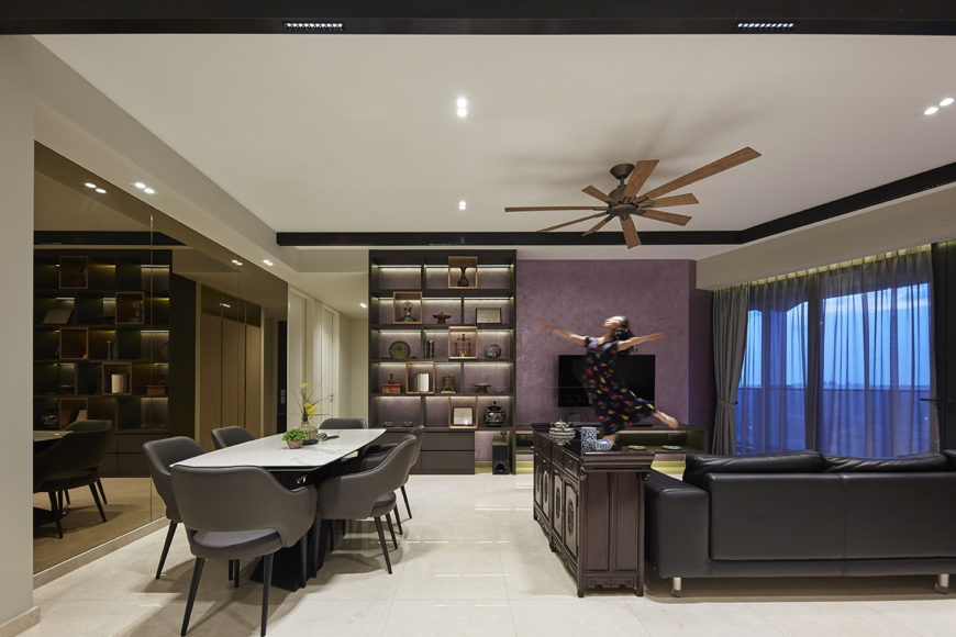
Another more budget-friendly and practical option is a closed concept interior plan. If done right, it can also be spacious and appealing too. The strategic placement of the bronze feature wall at Duo Residences is an ingenious touch. While visually expanding the space, it accentuates the luxe vibe. Aside from the bronze mirror feature, ensuring that the modestly-sized communal space is both fitting for the family of 5 to have a meal and some Netflix and chill moments requires ergonomic space-planning.
To enhance the visual flow of space while not compromising on its functionality, the interior designer proposed a semi-open concept interior. This is for the family of three who wants to keep an eye on their little one while cooking and working from home respectively. A half-height glass wall was used to segregate spaces while visually expanding the space. A customized design solution for the couple’s lifestyle, aesthetics, and budget. However, this might be a costly option that could be restricted to specific home layouts.
3. WALK-IN WARDROBE - YAY OR NAY
One of the ever-popular requests is to incorporate a walk-in wardrobe as part of their home interior design. The luxurious walk-in wardrobe trend is the dream of many individuals. However, is it feasible in terms of the following – budget and layout especially in Singapore? Here, are a few ways in which our designers incorporate walk-in wardrobes in petite homes in Singapore:
Using the extra common room for a walk-in wardrobe:
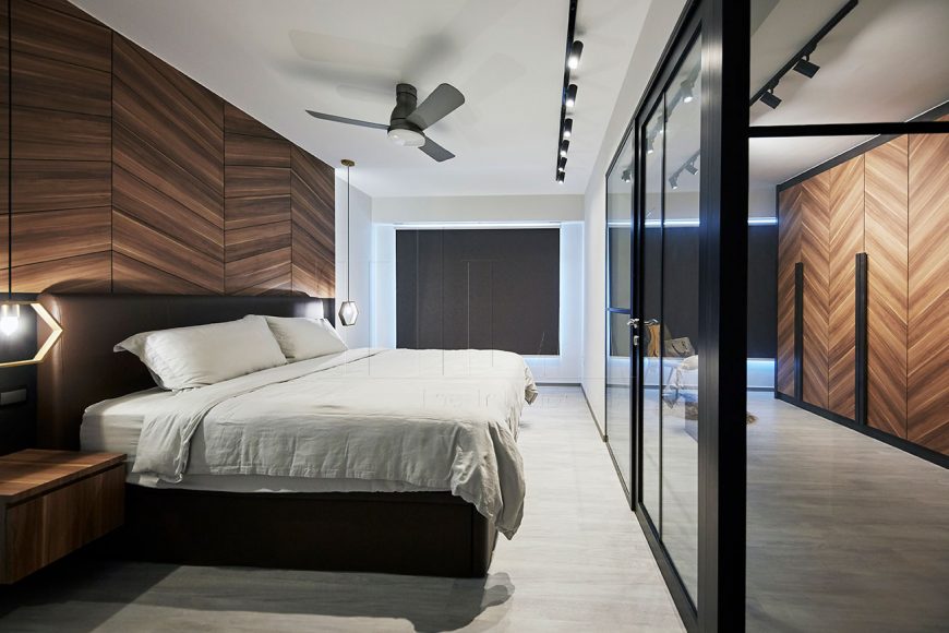
This 5RM BTO apartment opted for a semi-open concept plan. This is formed by black-framed glass which shows a consistent design language throughout the master bedroom.
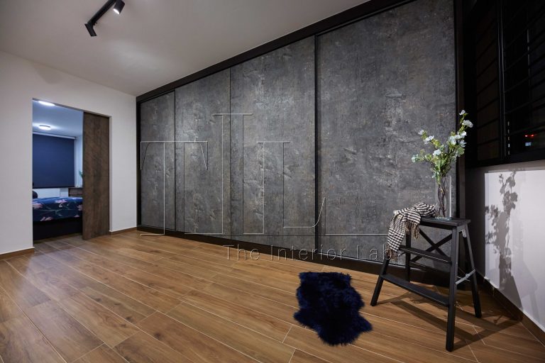
This 4RM resale apartment opted for a relative close-concept walk-in wardrobe. This is an interior plan which takes into account the difference in the homeowner’s sleep routine and work schedule.
This common room space includes a gorgeous bay-window, a customized vanity table as well as a black-tinted glass wardrobe. With thoughtful space planning, the interior designer created a dainty space that performs the function of the homeowner’s full morning routine.
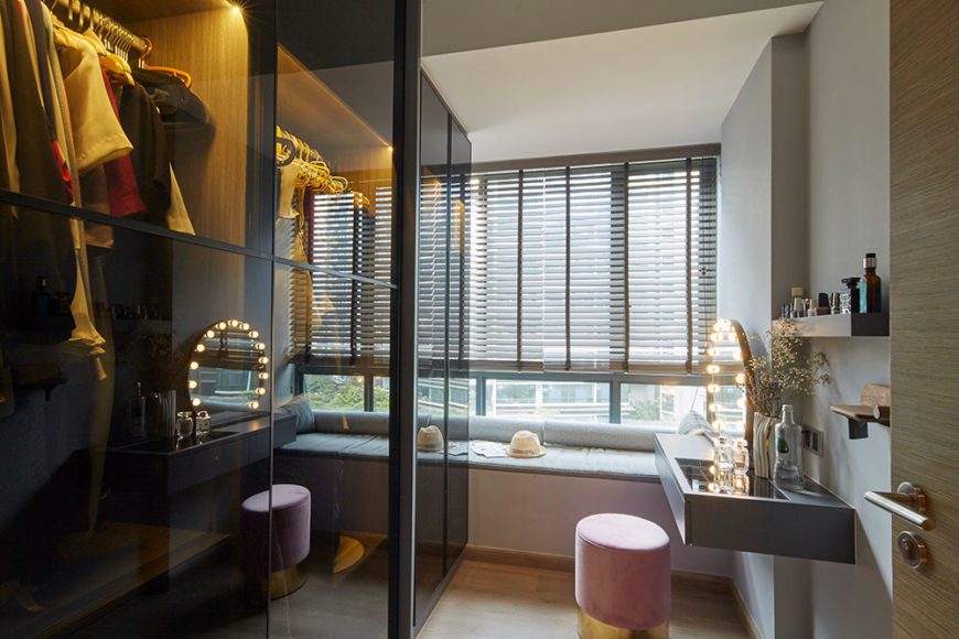
The majority of the homes with walk-in wardrobe are usually suited for couples. Thus, is there a better way to efficiently utilize the space especially when you have to cater to the lifestyle needs of a growing family?
A closed closet in the same master bedroom:
For this 3 bedder condominium, a walk-in wardrobe in a separate room or tapping on additional communal space is not feasible. As they have a growing child with them who needed his own personal space. And the additional common room is used as a guest room to host their relatives/friends. With adequate space planning, the interior designer manages to fit sufficient storage space for clothings and even a customized vanity table for the couple. Not to mention the gorgeous curved bay window.
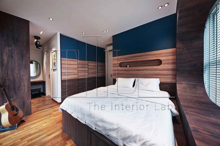
For this 4RM BTO flat, the interior designer created a u-shaped wardrobe to efficiently tap on all floor spaces while creating a segregated corner for the closet.
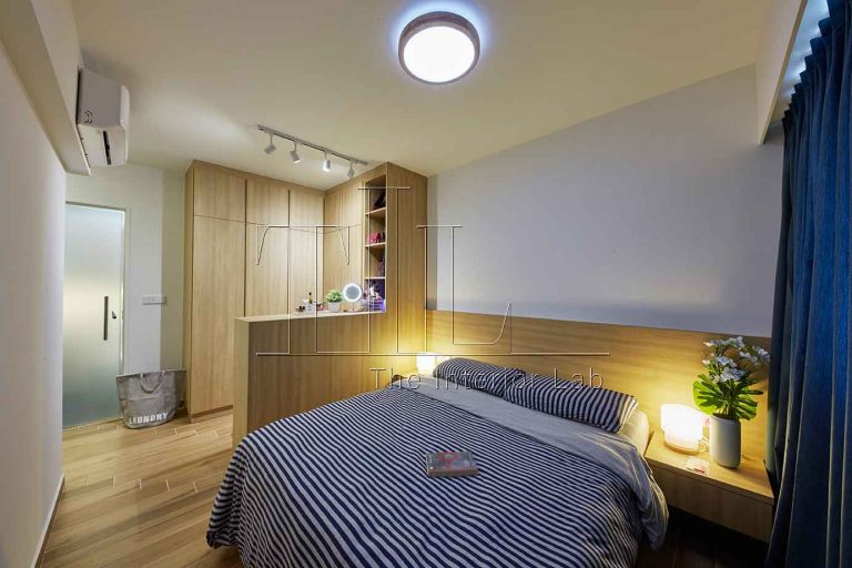
Another plausible option is having a room within a room. With a fluted glass door, it partially obscures the closet while providing a lighter feel as compared with an opaque door. Depending on your definition of a walk-in wardrobe this wardrobe falls into the grey area of that. Perfect for petite homes in Singapore!
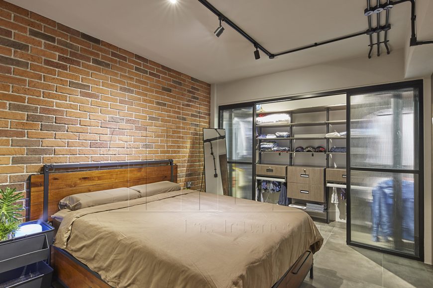
Aside from the above dilemma mentioned, many of the homeowners still face other interior design conundrums such as whether a balcony space should be indoor or outdoor, whether a vanity space should be standing or seating, and even the overall layout of the kitchen. A home renovation is not an easy feat even for non-first time homeowners. Hopefully, this article has helped to give more insights into the pros and cons of the common dilemmas faced by homeowners.
CONSULT OUR DESIGNER
-
23 March 2026 DESIGN INSPIRATION
Commercial-Grade Solutions: Bringing Professional Office Design Home
-
23 March 2026 HOME TOUR
Home Cinema Living Rooms: Integrating Theatre Systems Elegantly
-
23 March 2026 TIPS & GUIDES
Muji x HDB: Elevated Minimalist Living in Your Resale Flat
-
23 March 2026 DESIGN INSPIRATION
Acoustic Ceiling Solutions: Sound Management in Open-Concept Homes
-
30 January 2026 TIPS & GUIDES
Best Lighting Layouts for Small and Dark Kitchens: A Guide to Kitchen Interior Design in Singapore
-
30 January 2026 TIPS & GUIDES
What Makes a Home Look Premium? Best Interior Design Ideas for a High-End Aesthetic in Singapore

