An Air Of Laidback Nostalgia Breezes Through This Rustic Abode
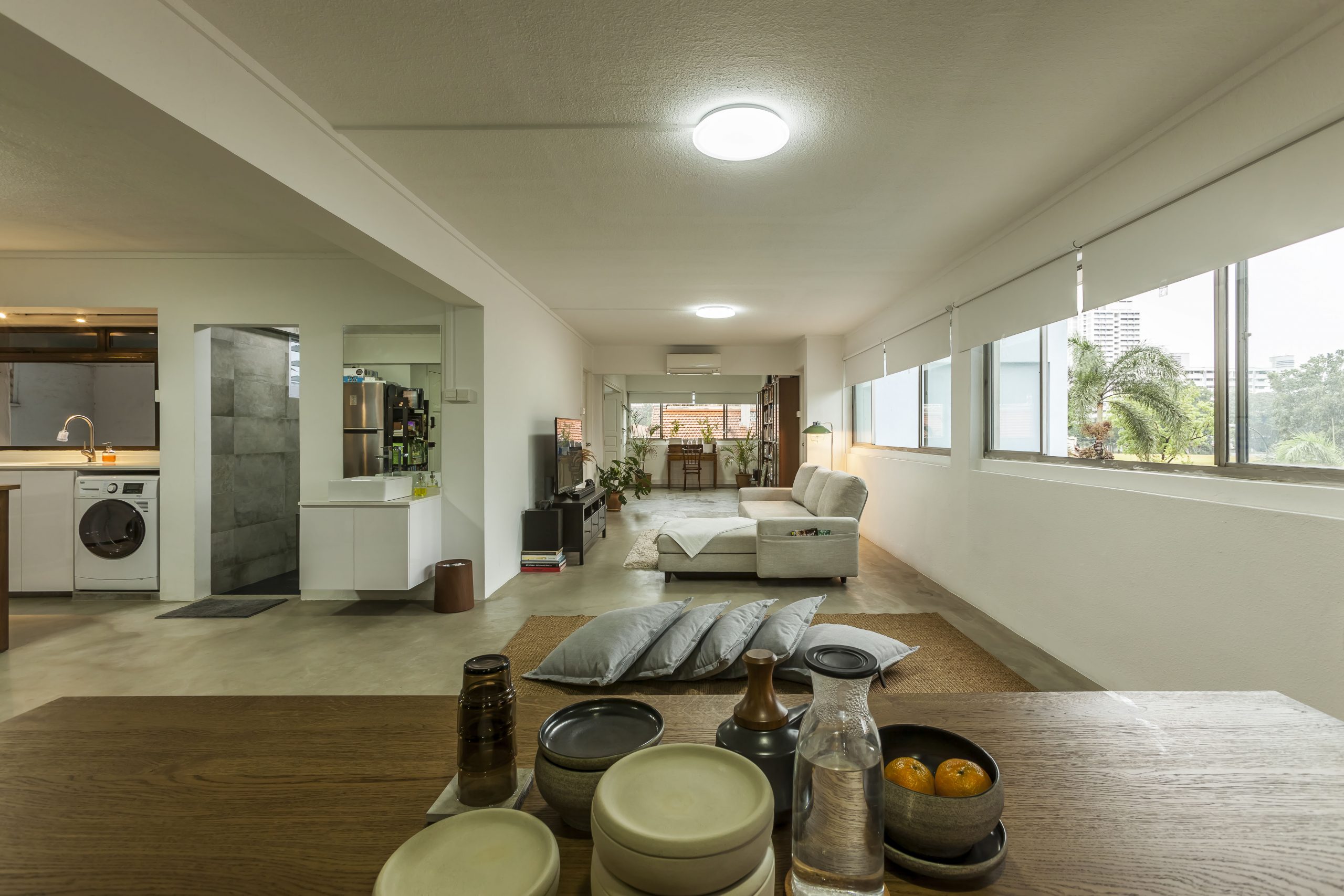
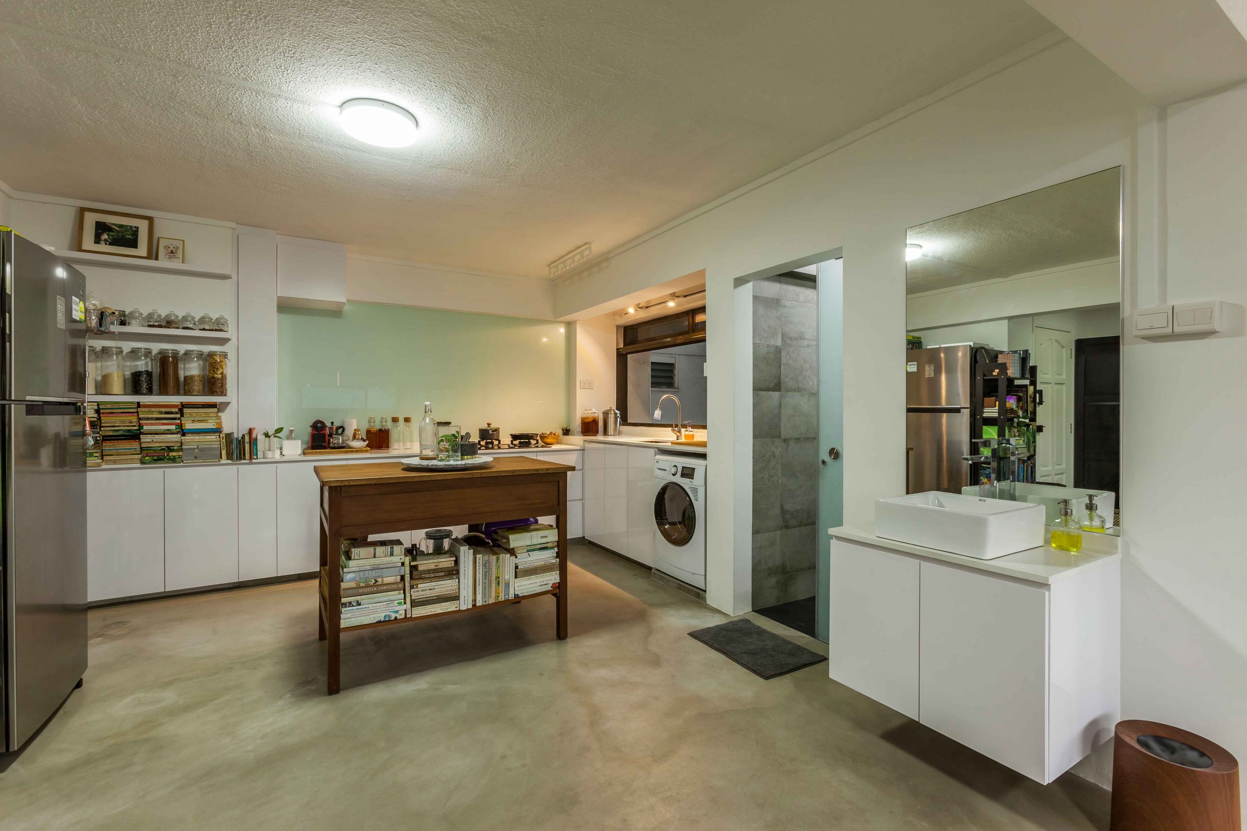
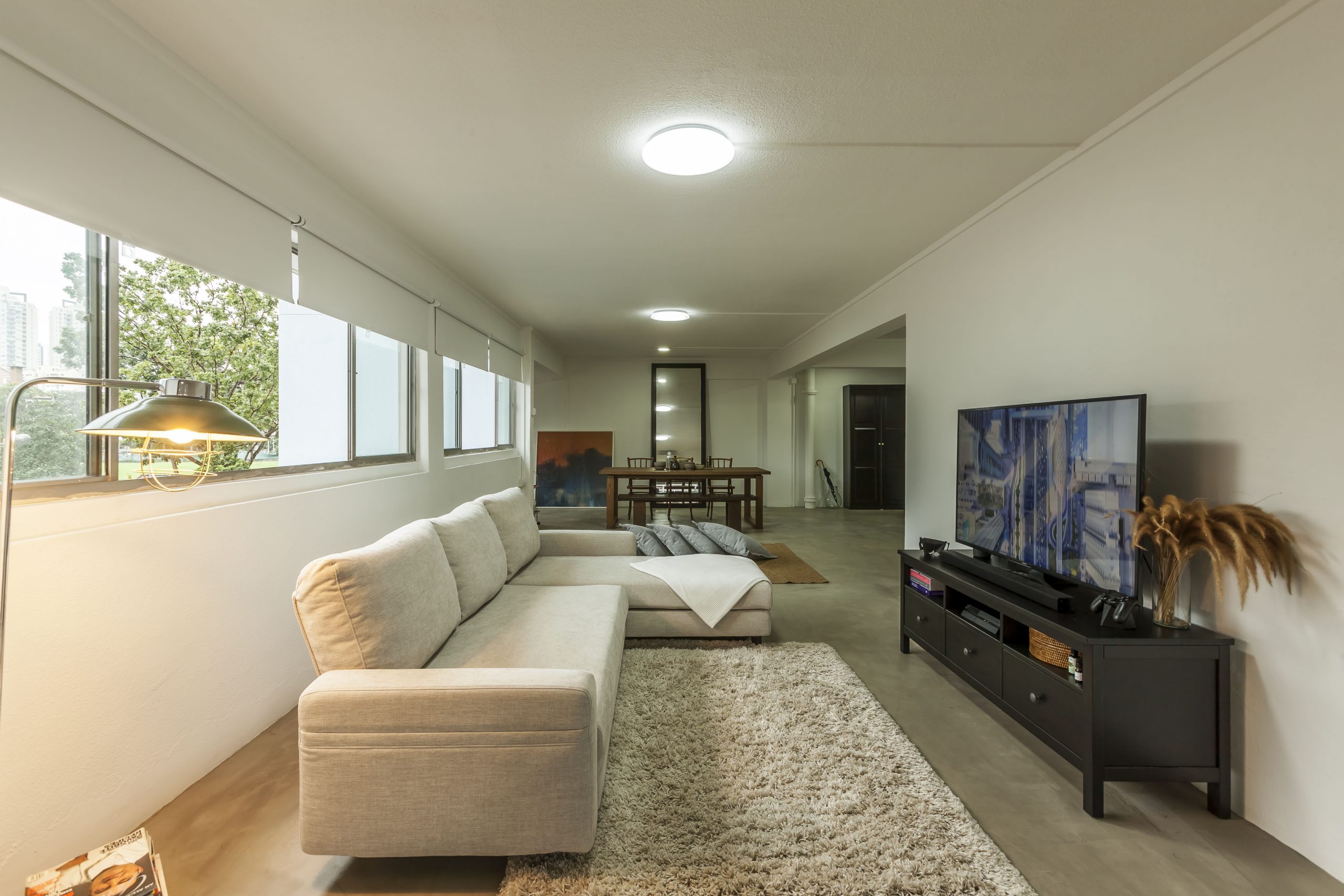
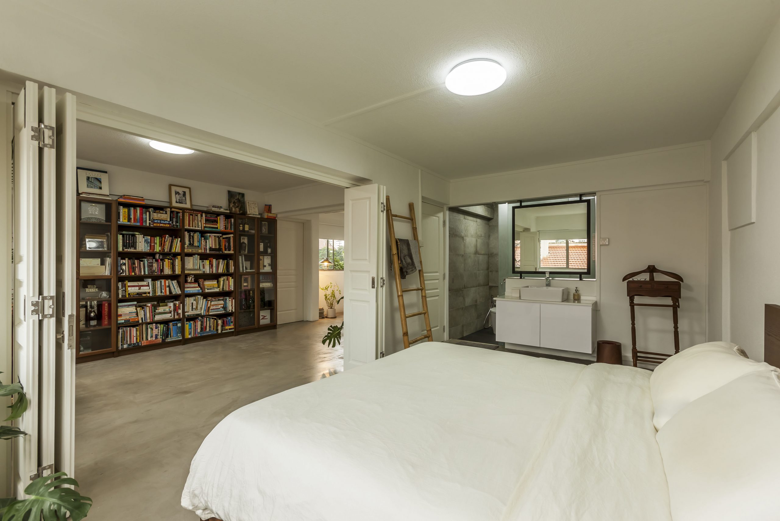
Defined by clean lines, organic forms and minimal ornamentation, this airy apartment adds a rustic touch to the typical mid-century interior design. The hacking down of walls visually expands the communal area, allowing light to flow through the space undisrupted. With white walls contrasting the raw grey finish of the cement screed floor, there is a calming minimalism that accompanies this neutral colour palette.
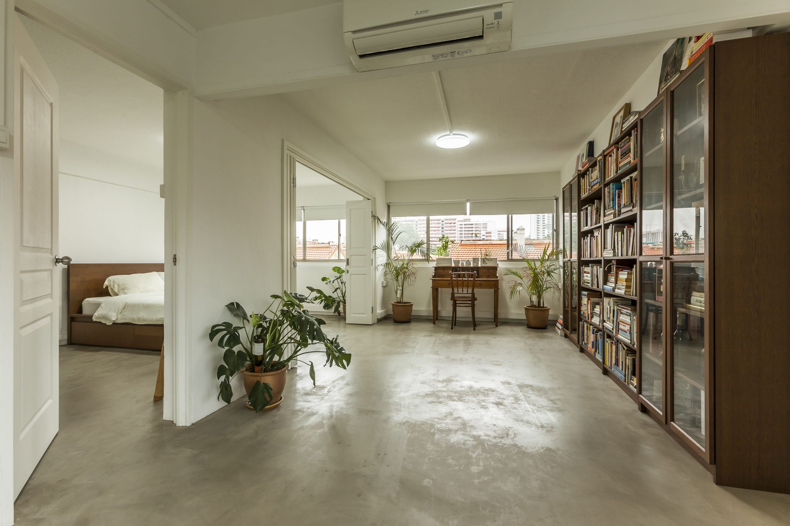
A tall bookcase cum display shelf runs the length of the wall in front of the bedroom, its walnut brown finish reminiscent of rustic bookstores tucked in the midst of quiet neighbourhoods. Varying shades of wood pepper the living space, simultaneously creating a firm sense of consistency and adding a touch of warmth to this breezy apartment.
Interior Designer’s Thoughts
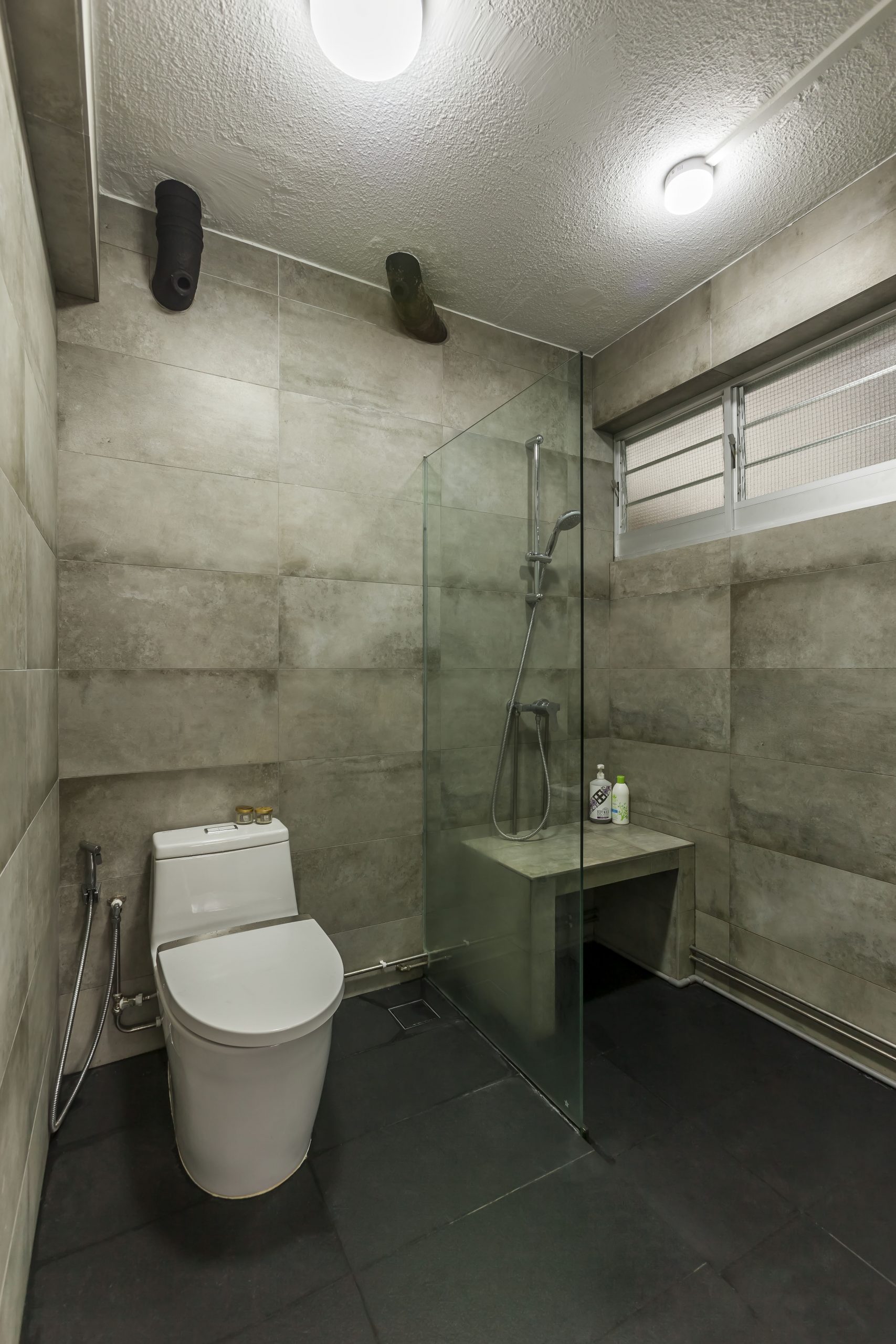
While mid-century interior design is usually characterised by pops of colour, the homeowners wanted a space with a soft, neutral palette. Colours in the home were thus kept to a minimal, allowing the vintage-style, wooden furnishing to stand out. Textures come into play in the uneven finish of the floors, ceiling and vintage furnishing, and the home is further spruced up with soft furnishing items and house plants.
The designer separated the bedroom from the communal area with foldable double doors that pull back to widen and brighten the space. This gives the homeowners an option to keep the bedroom private when having guests over.


