An Idyllic Family Home Connected To Nature
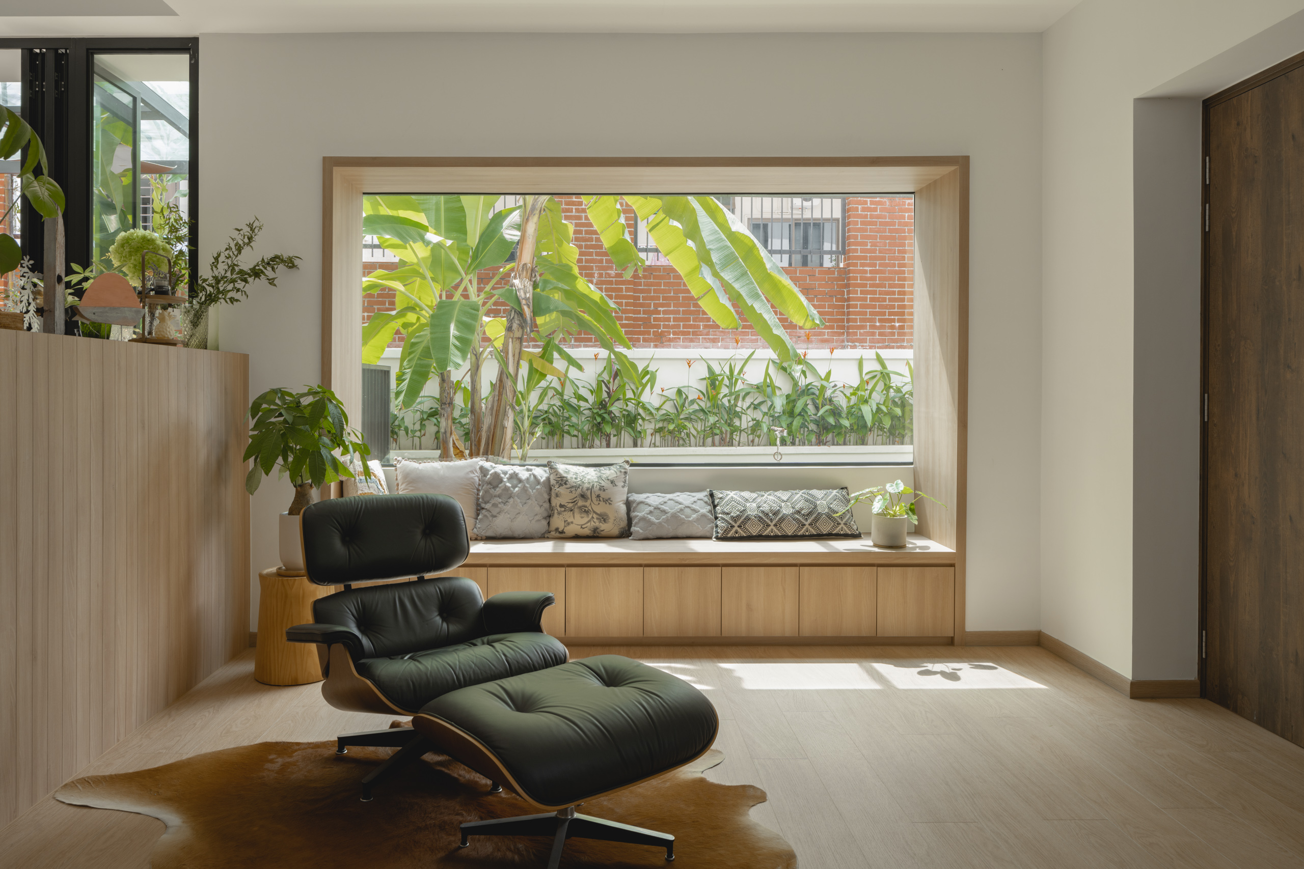
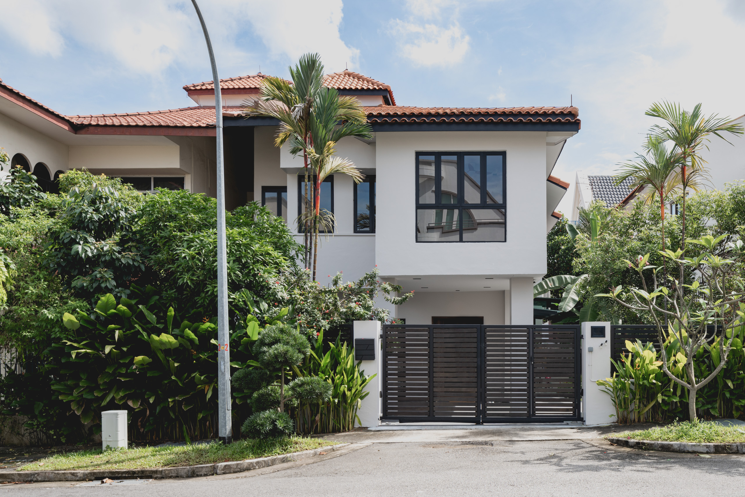
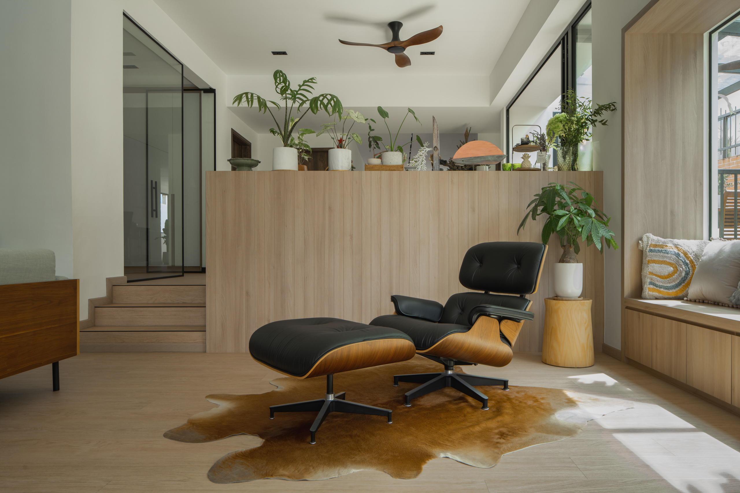
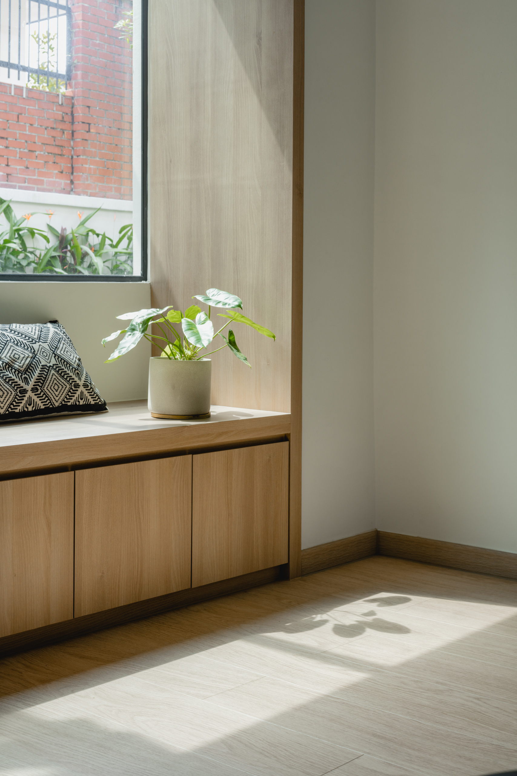
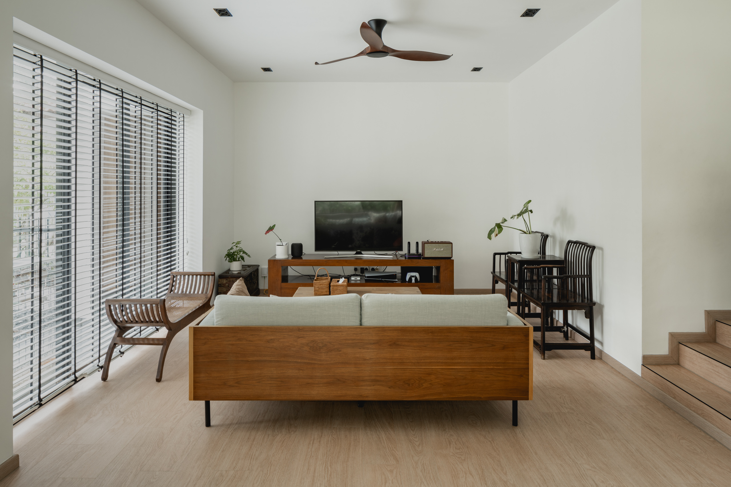
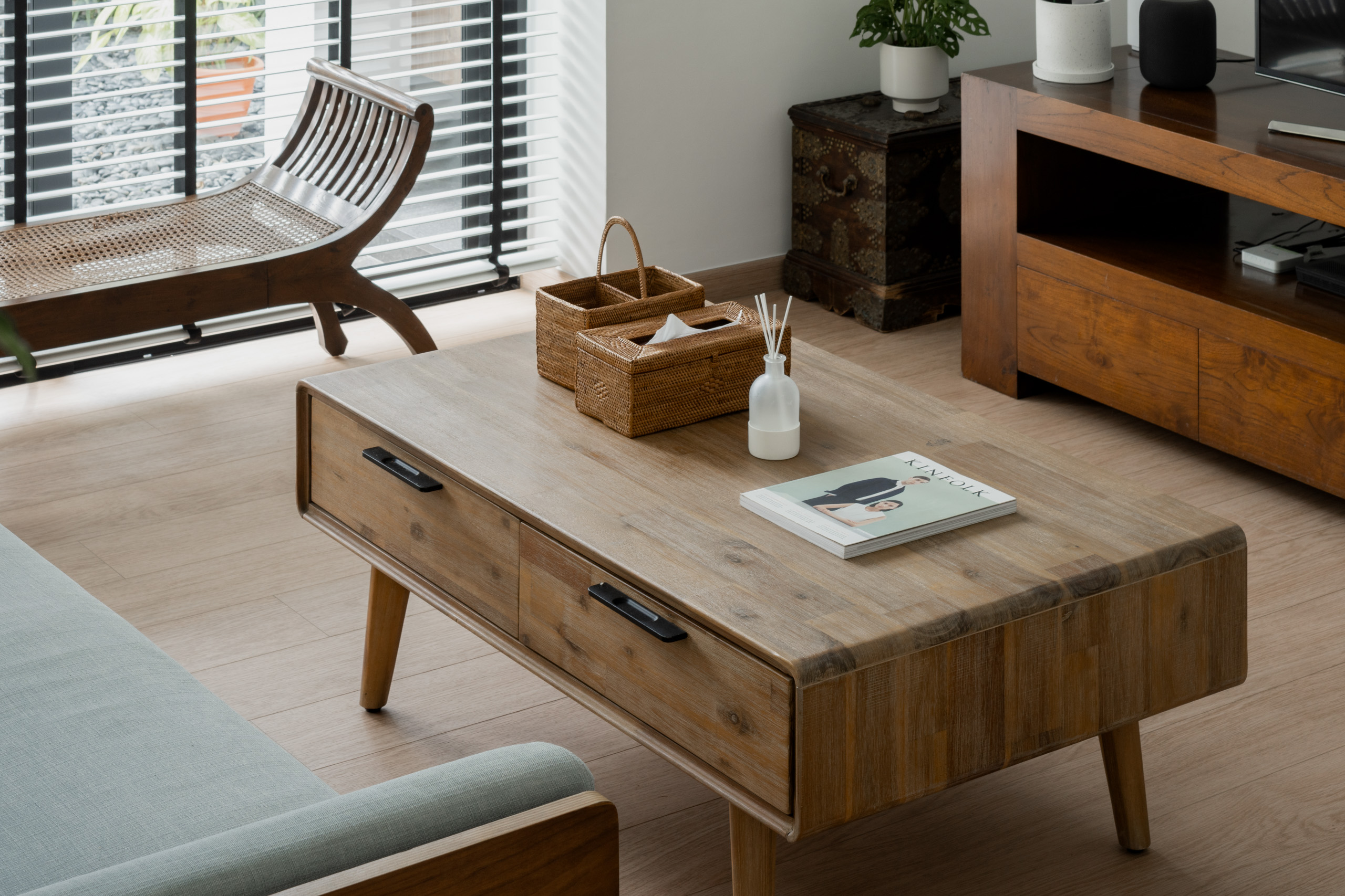
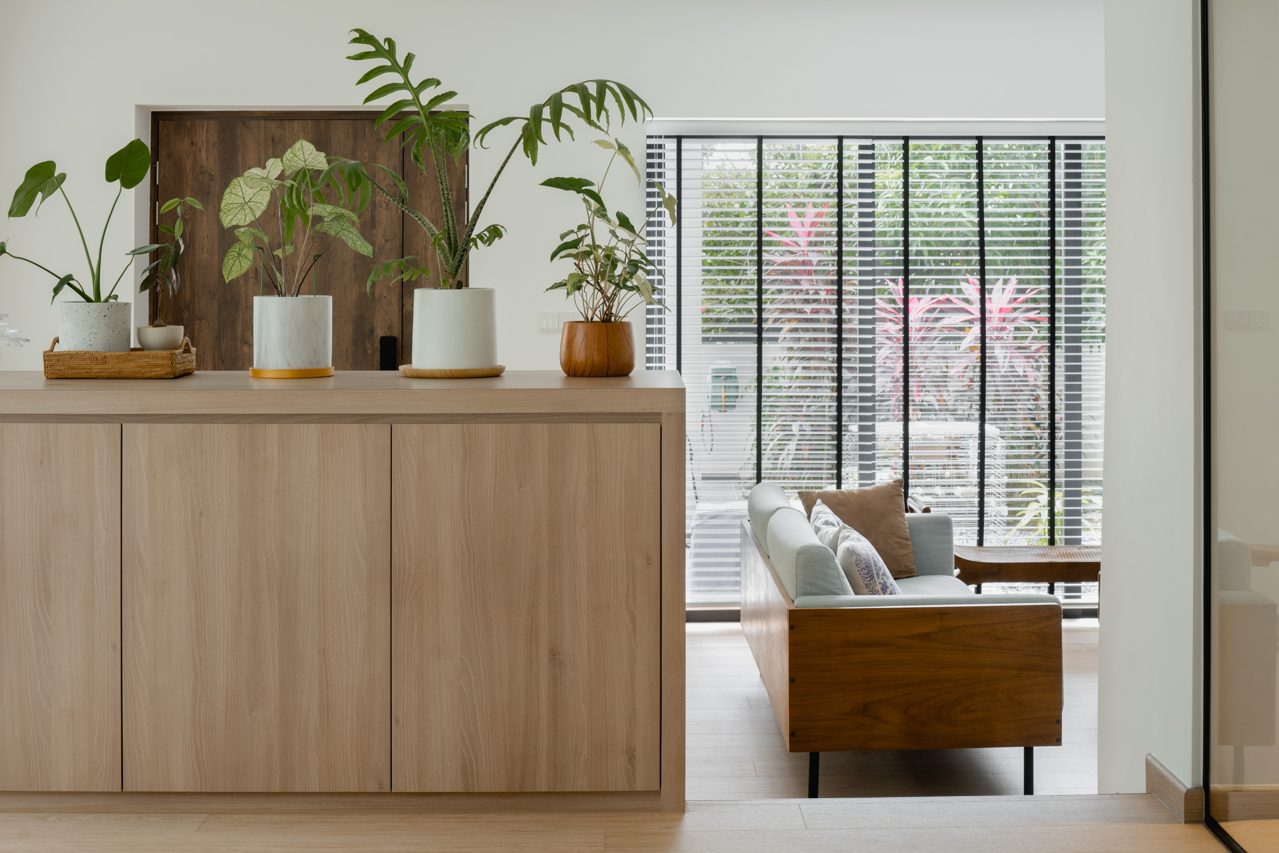
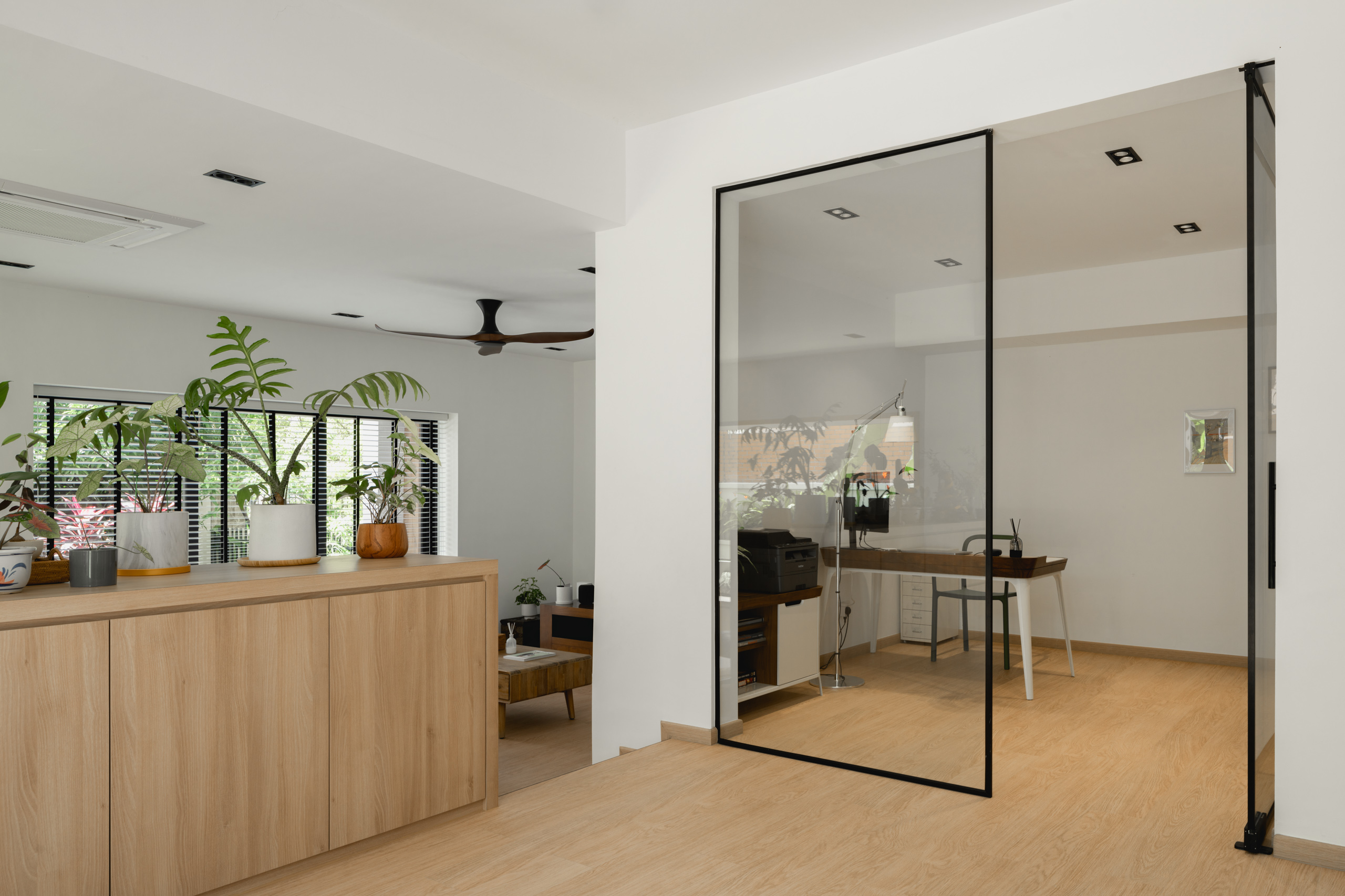
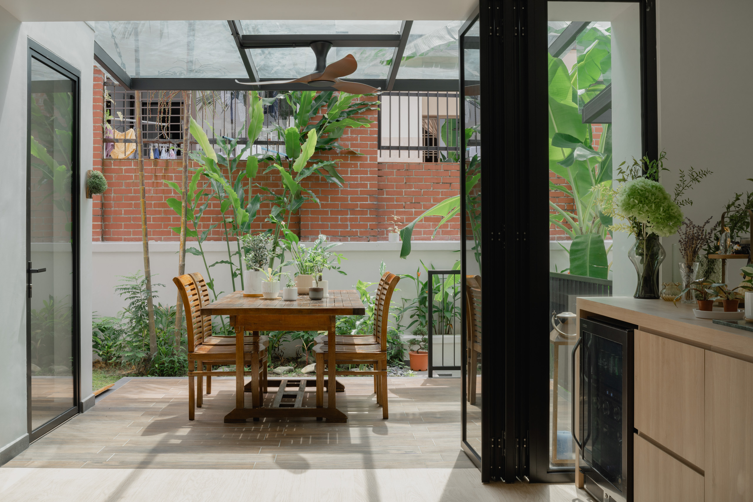
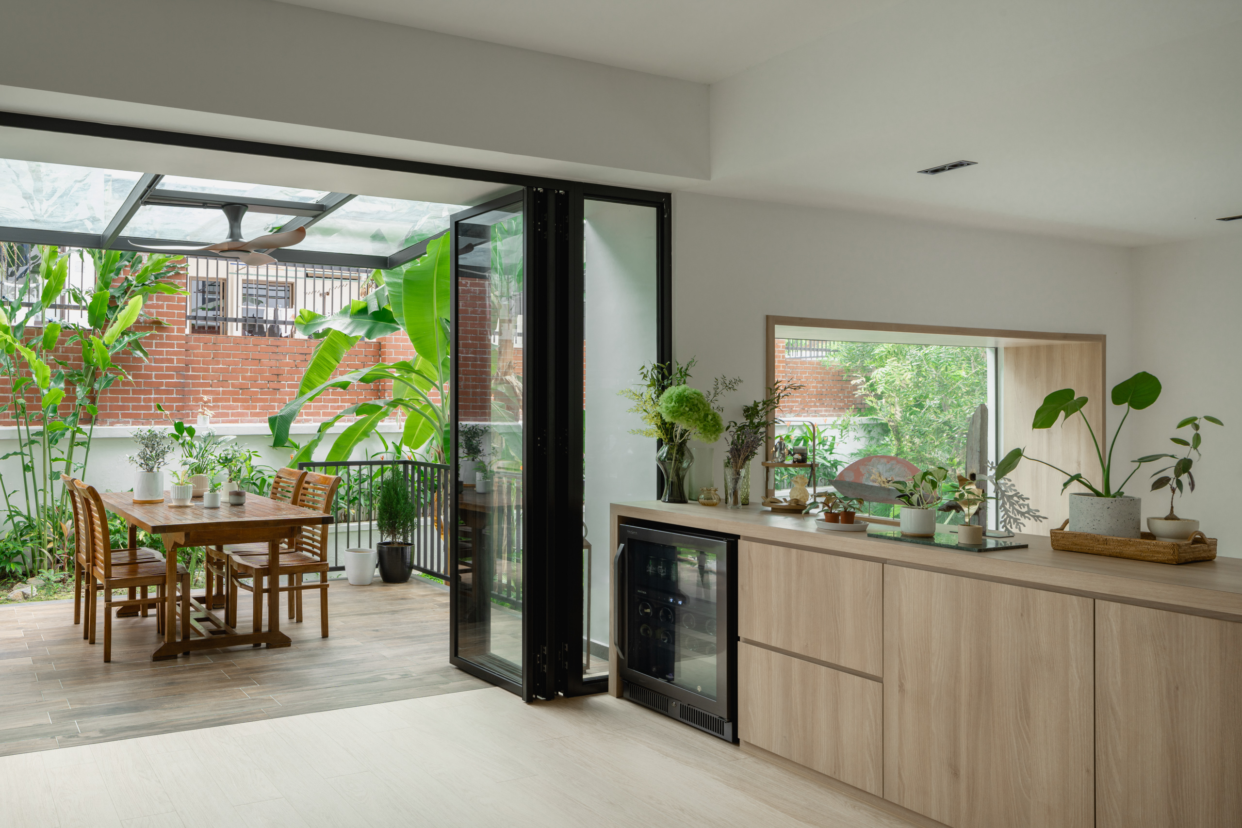
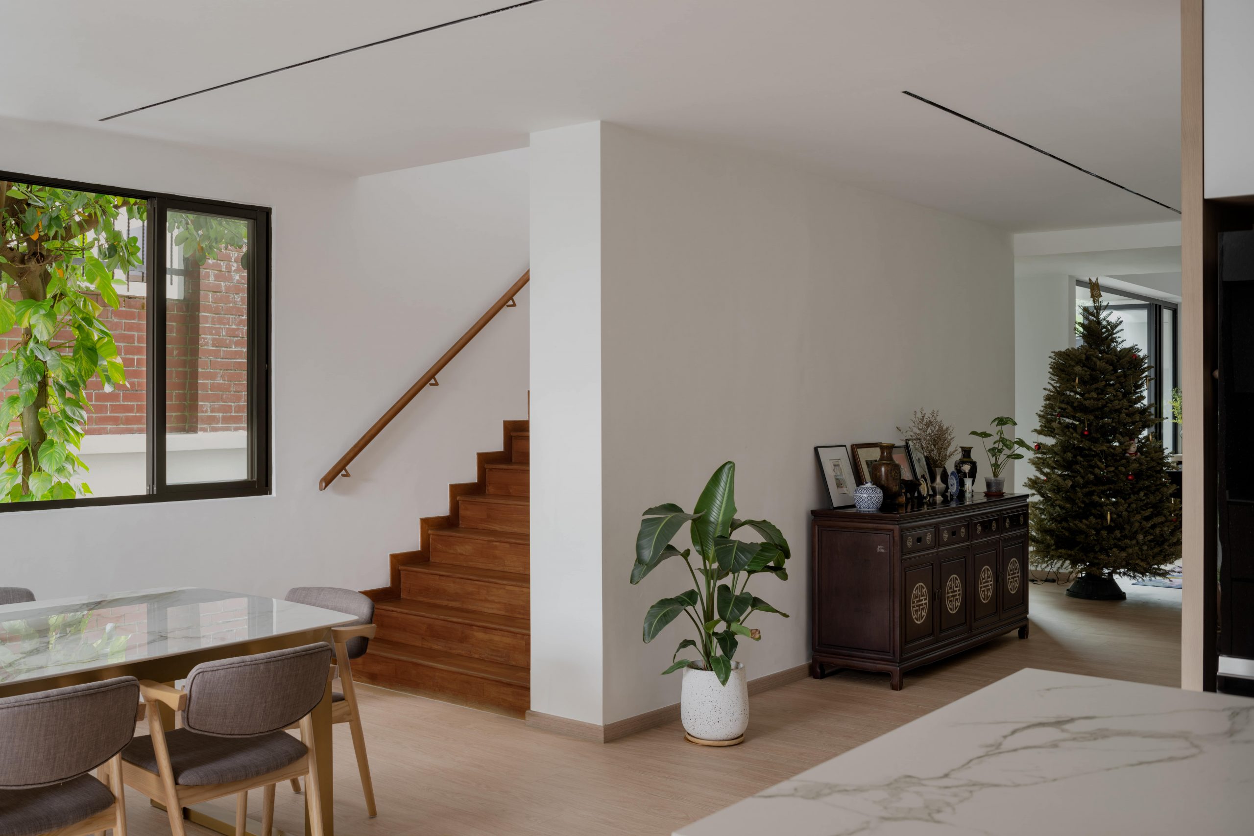
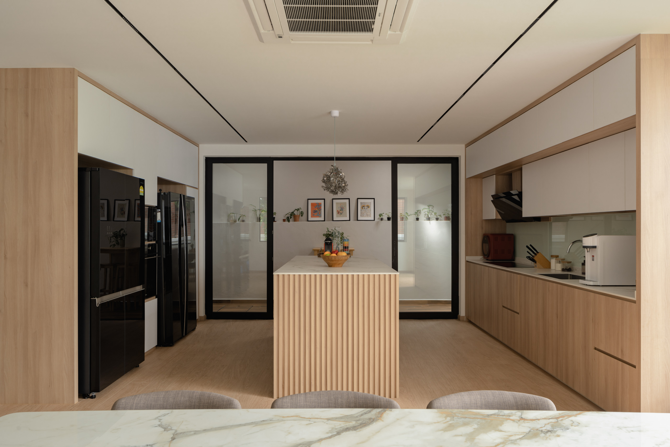
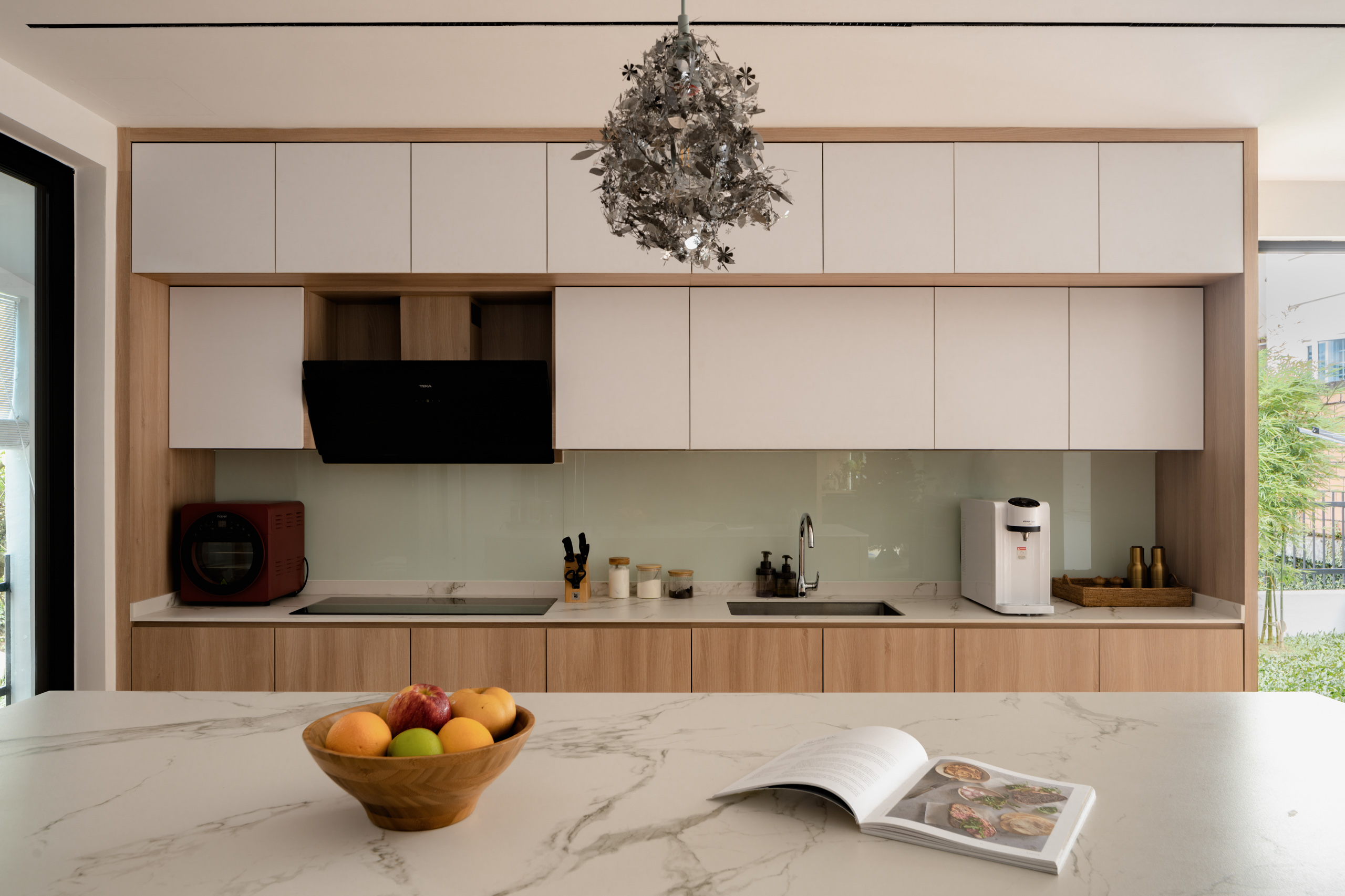
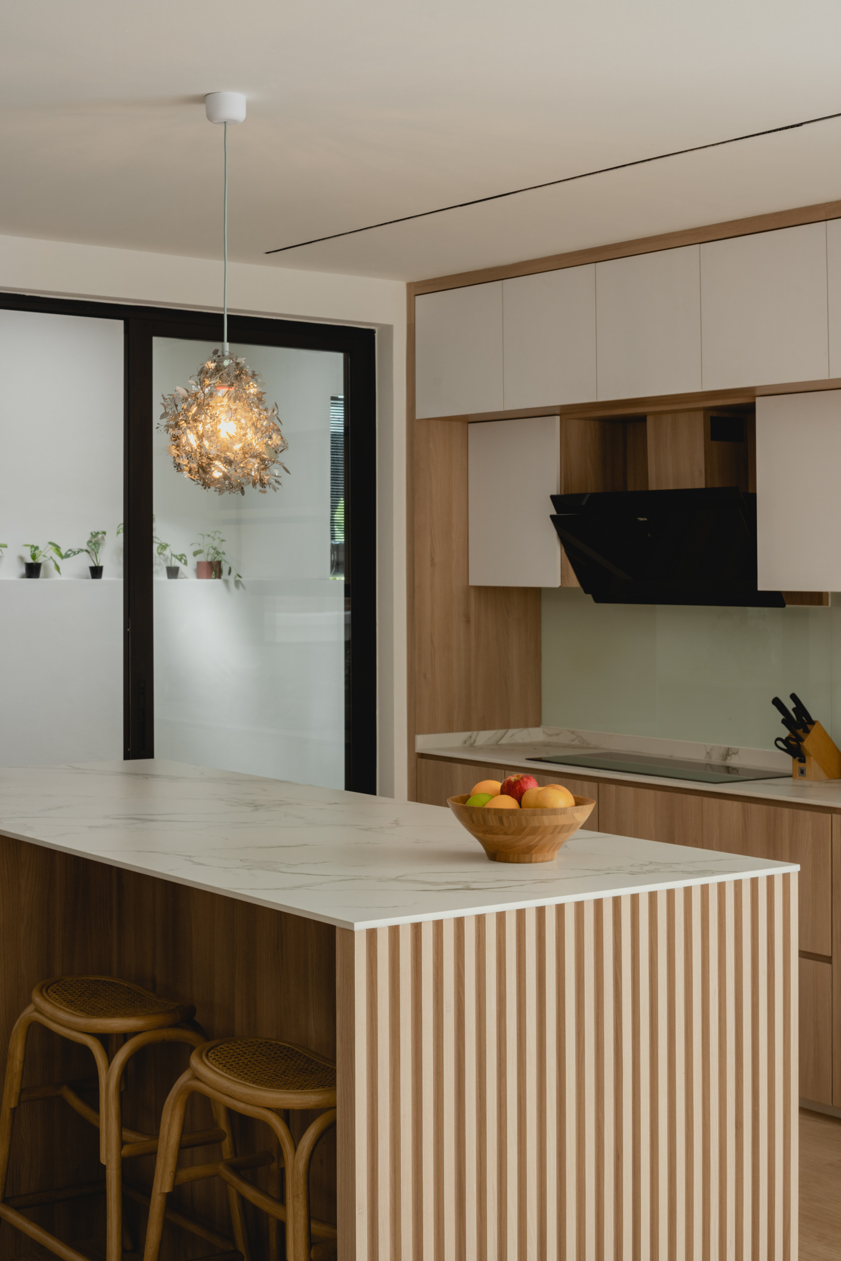
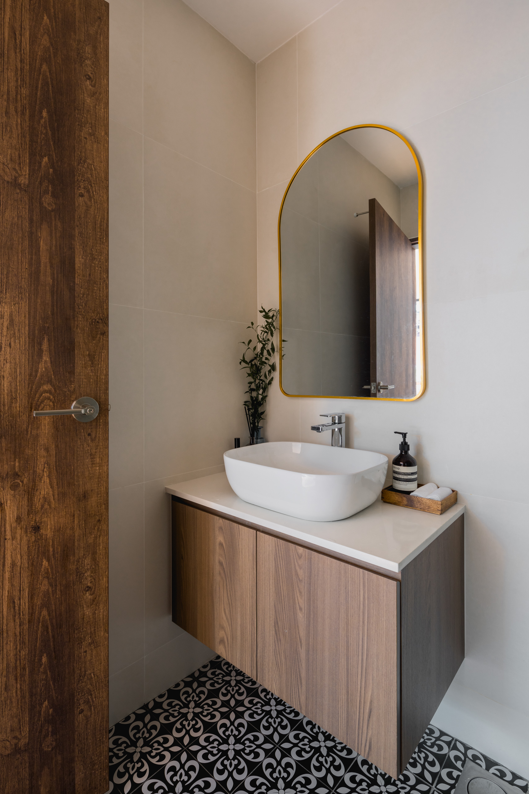
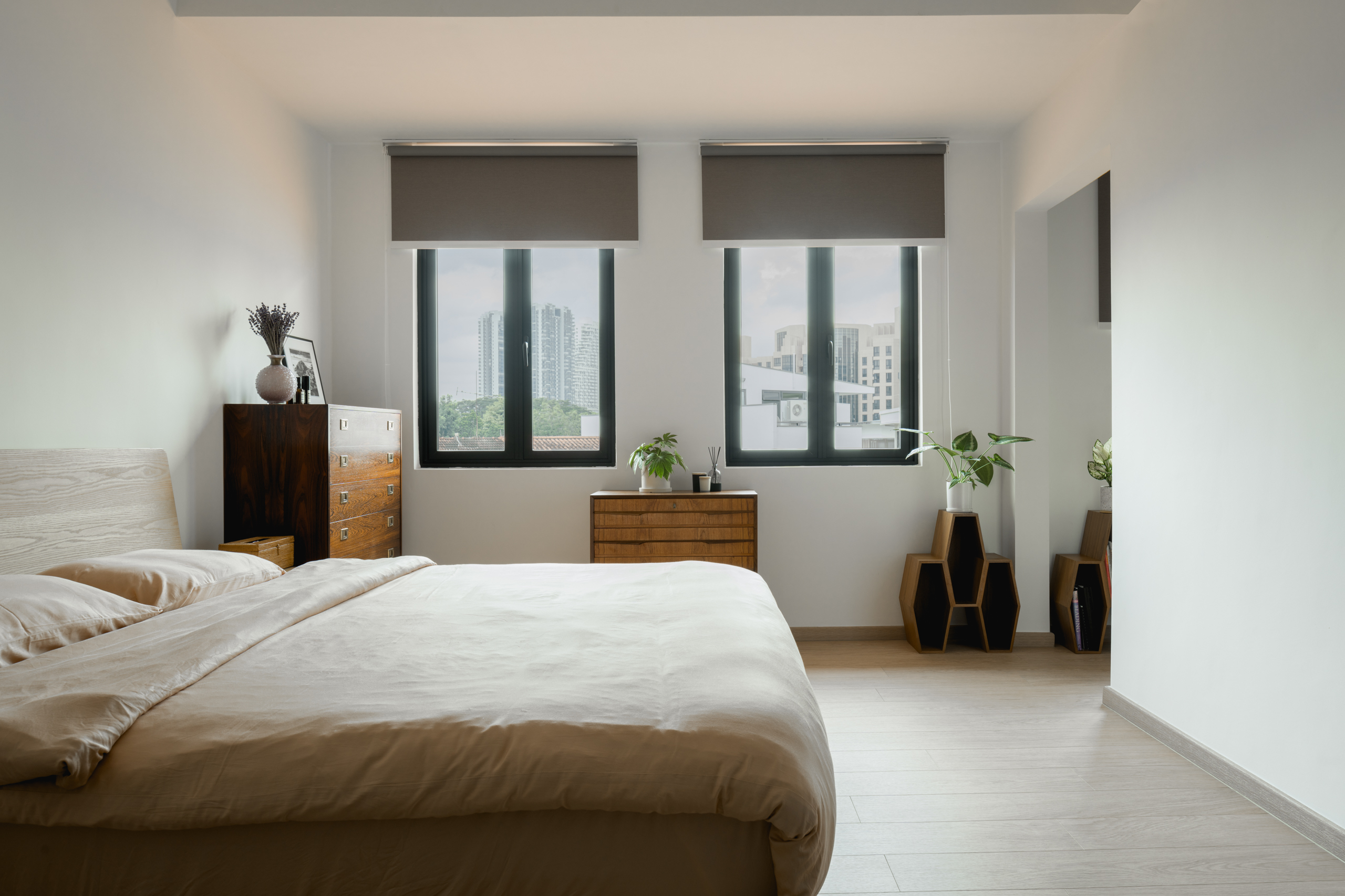
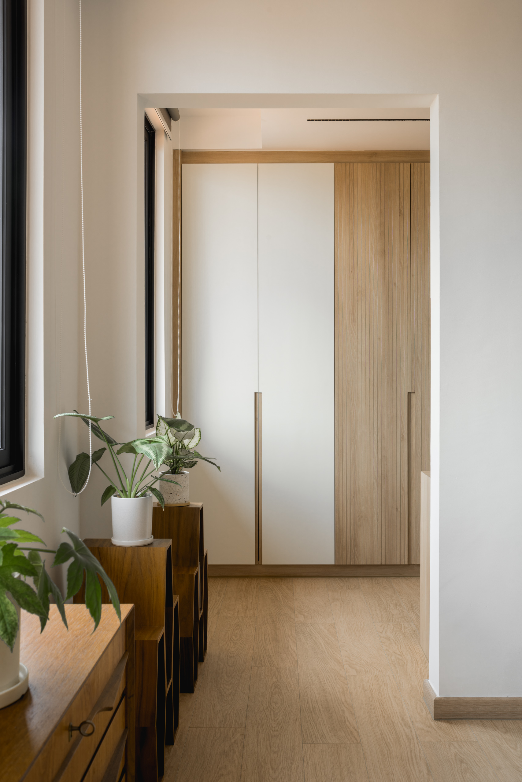
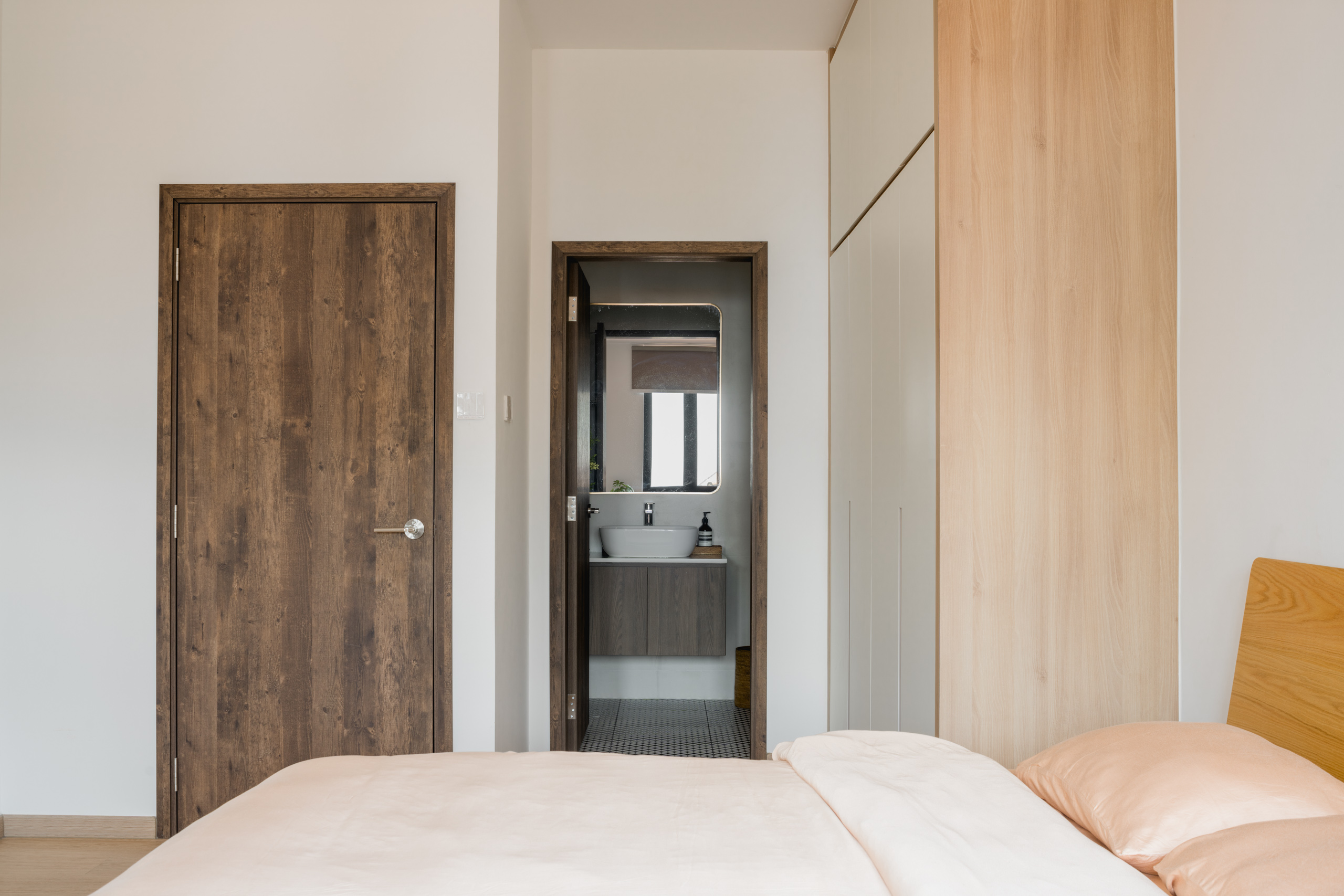
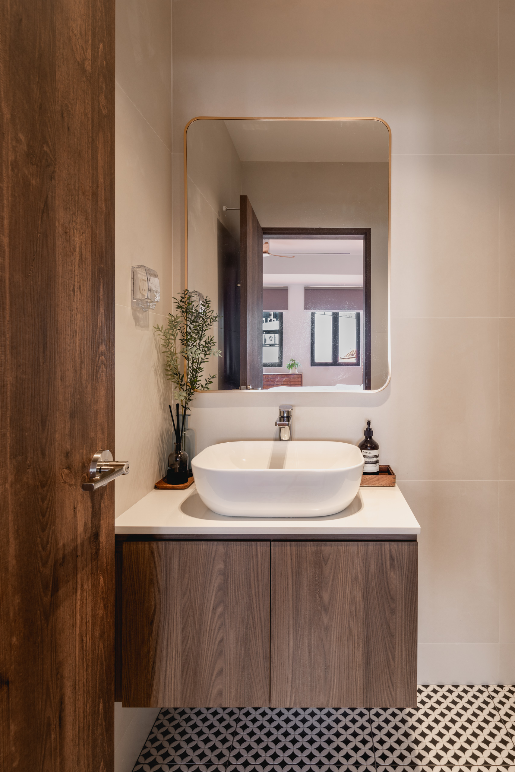
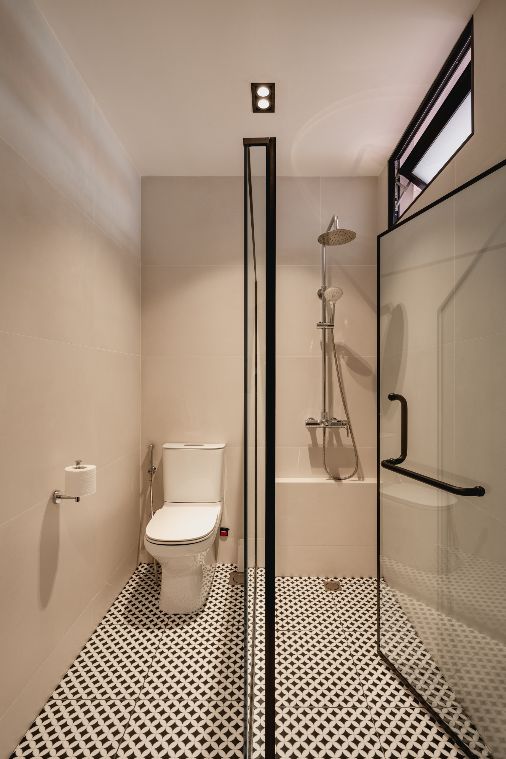
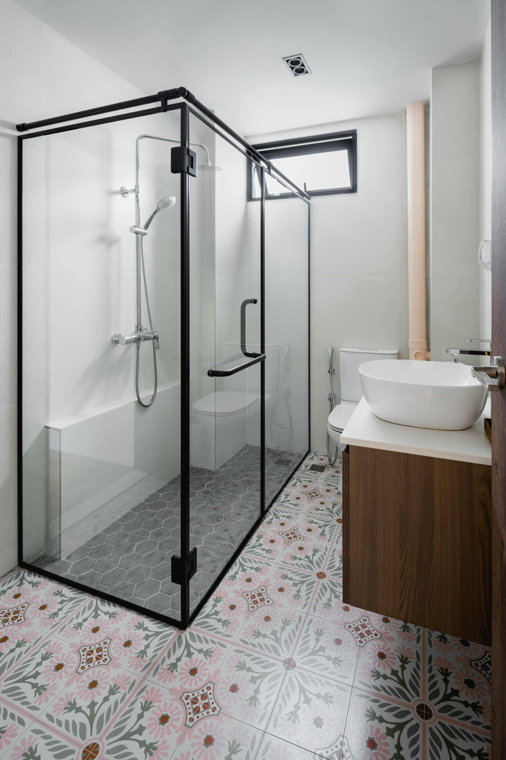
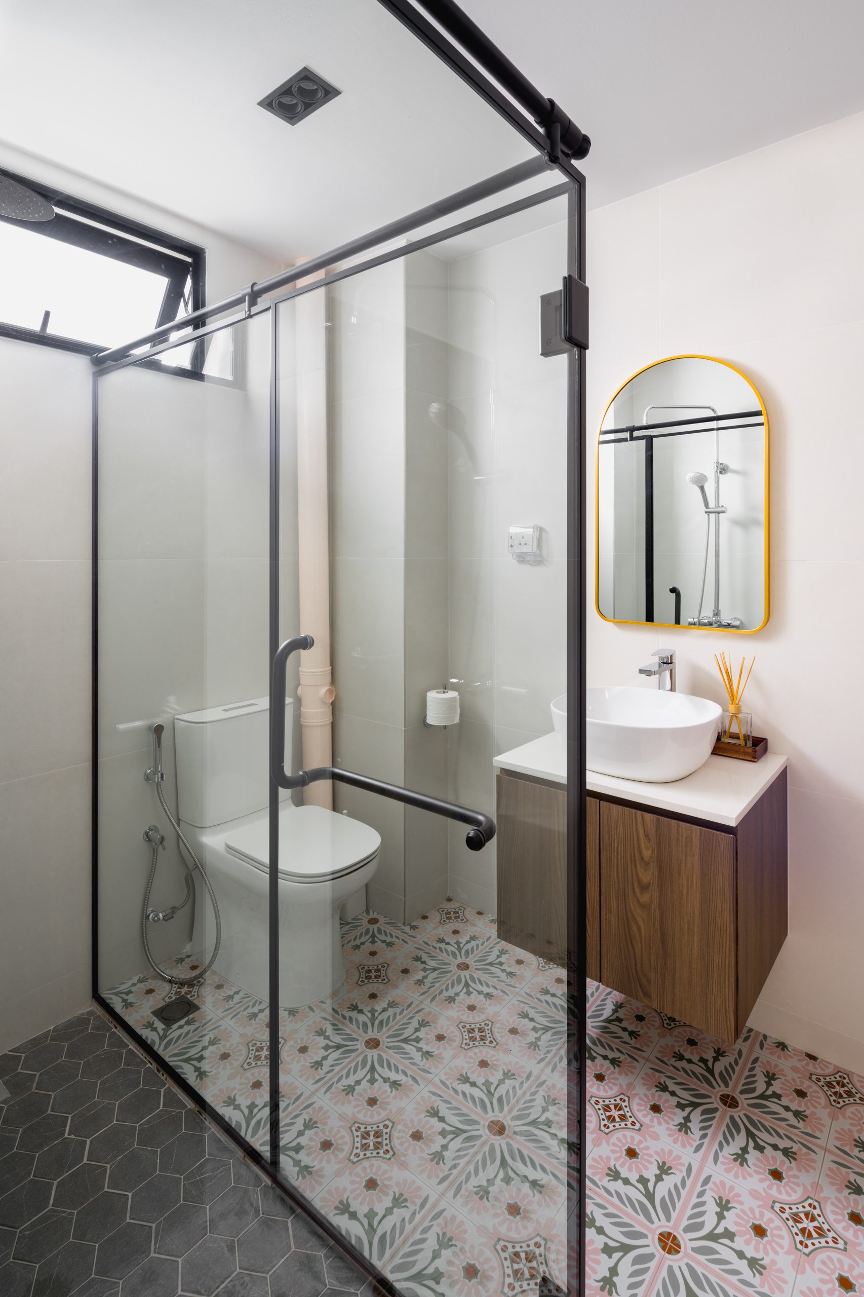
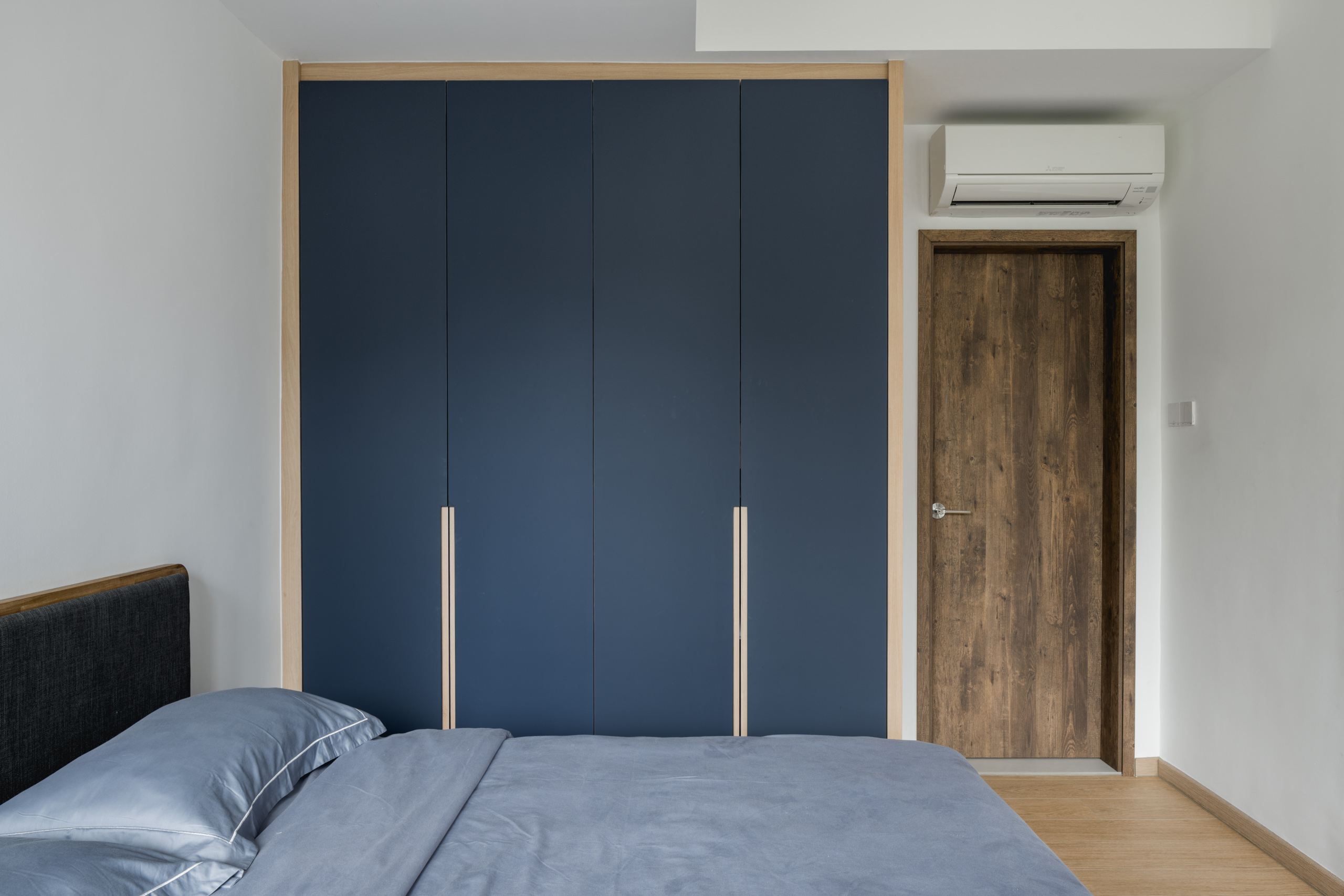
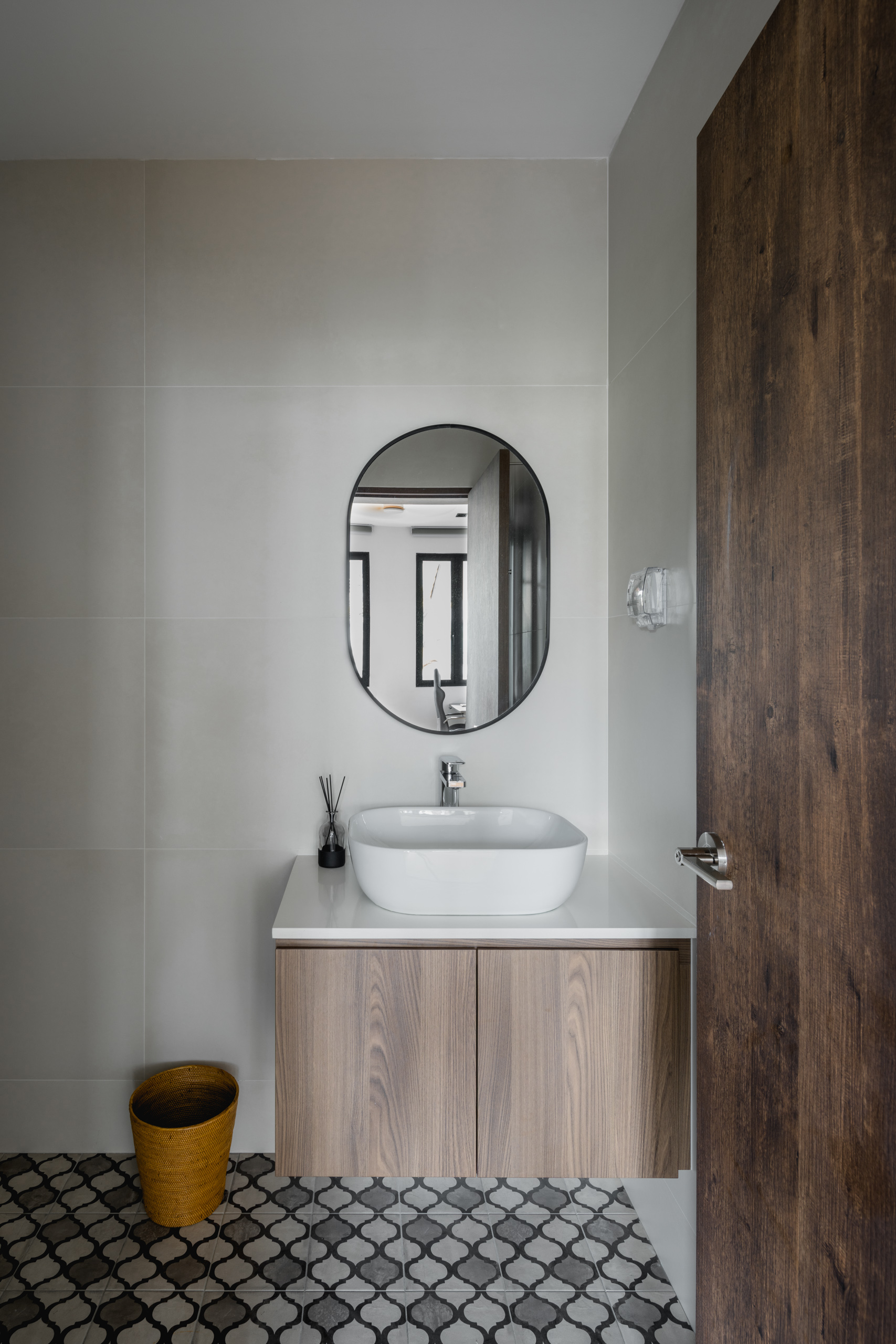
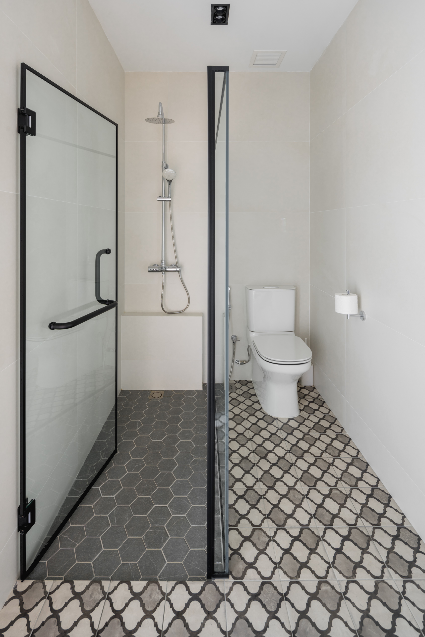
Nestled in the heart of a residential neighbourhood, this tranquil haven’s Japandi home interior is the epitome of warmth, comfort and functionality. Boasting a timeless medley of neutral colours and warm wood furnishes, this capacious abode evokes a feeling of ease and repose. An expansive bay window seat overlooks the garden, impeccably framing the luscious greenery and elevating the communal space with the captivating beauty of nature. An overflowing stream of sunlight floods into the living room, gently diffused by venetian blinds. Partitioned by a clear glass panel and lined with open shelving units, the office space makes for a bright and conducive environment. An array of potted greenery brings forth vibrancy into the space – bridging a connection to nature from the outside in. Wooden fluted panels of the kitchen island highlights refined detailing against the white and neutral cabinetry, presenting a clean and timeless appearance. Clad in rich teak wood and a light colour palette, the master bedroom is an oasis of comfort. Strategically hidden out of sight, the walk-in wardrobe and home office layout exhibits seamless functionality. Geometric grey textiles add a compelling feature in the bathrooms, complementing its overall understated nature. Paired with a pristine environment, the rejuvenating haven exudes an air of serenity and peace.
Interior Designer's Thoughts
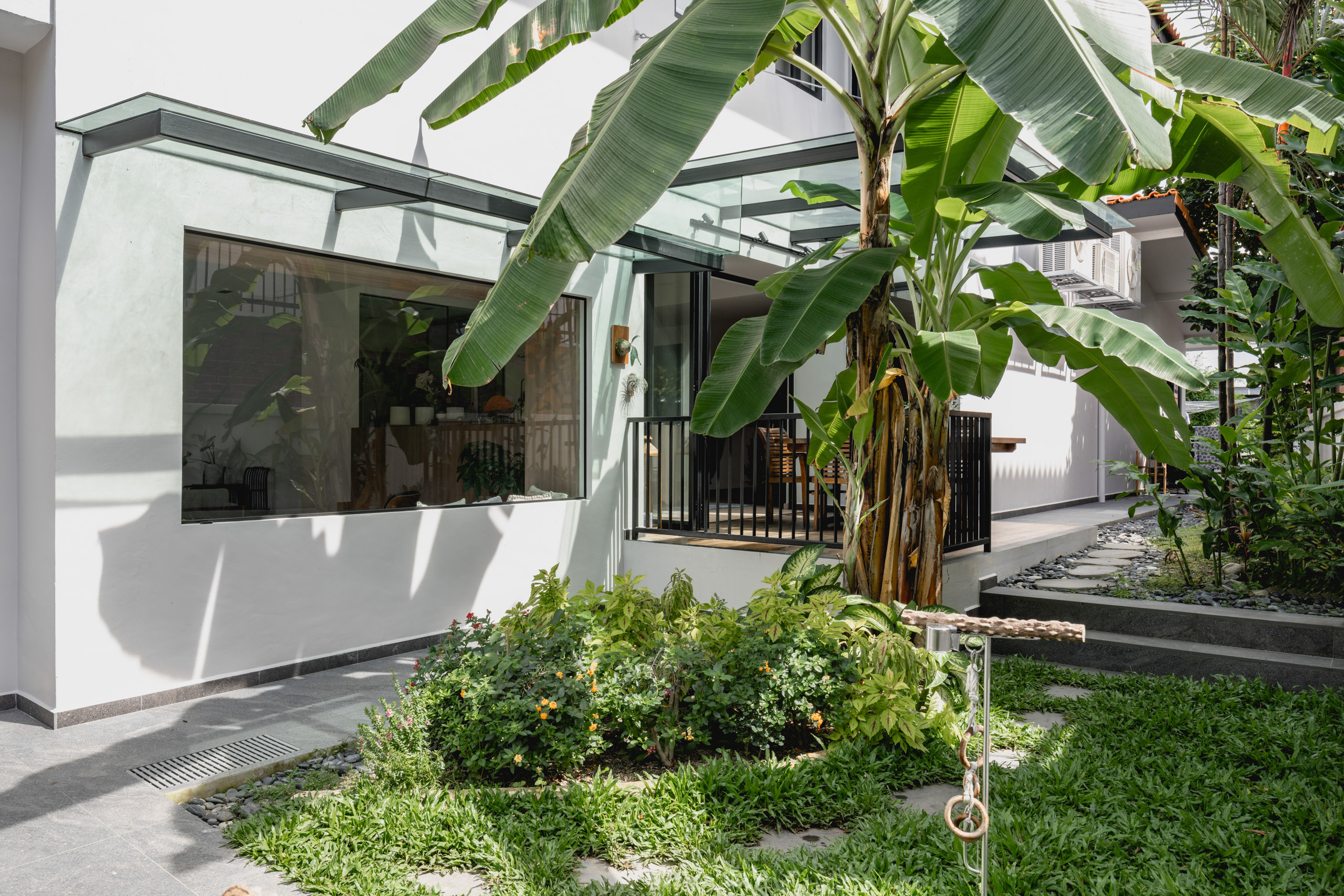
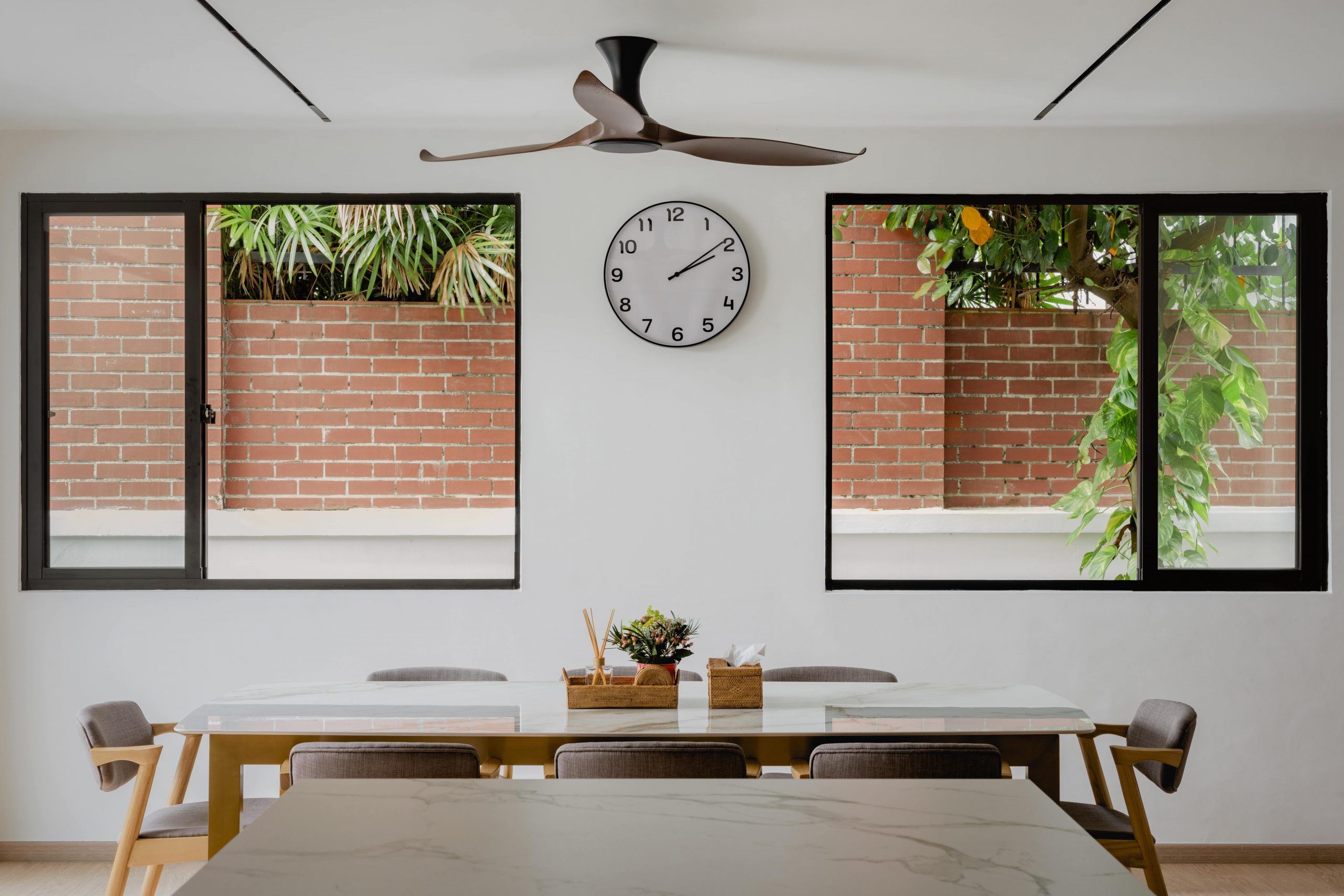
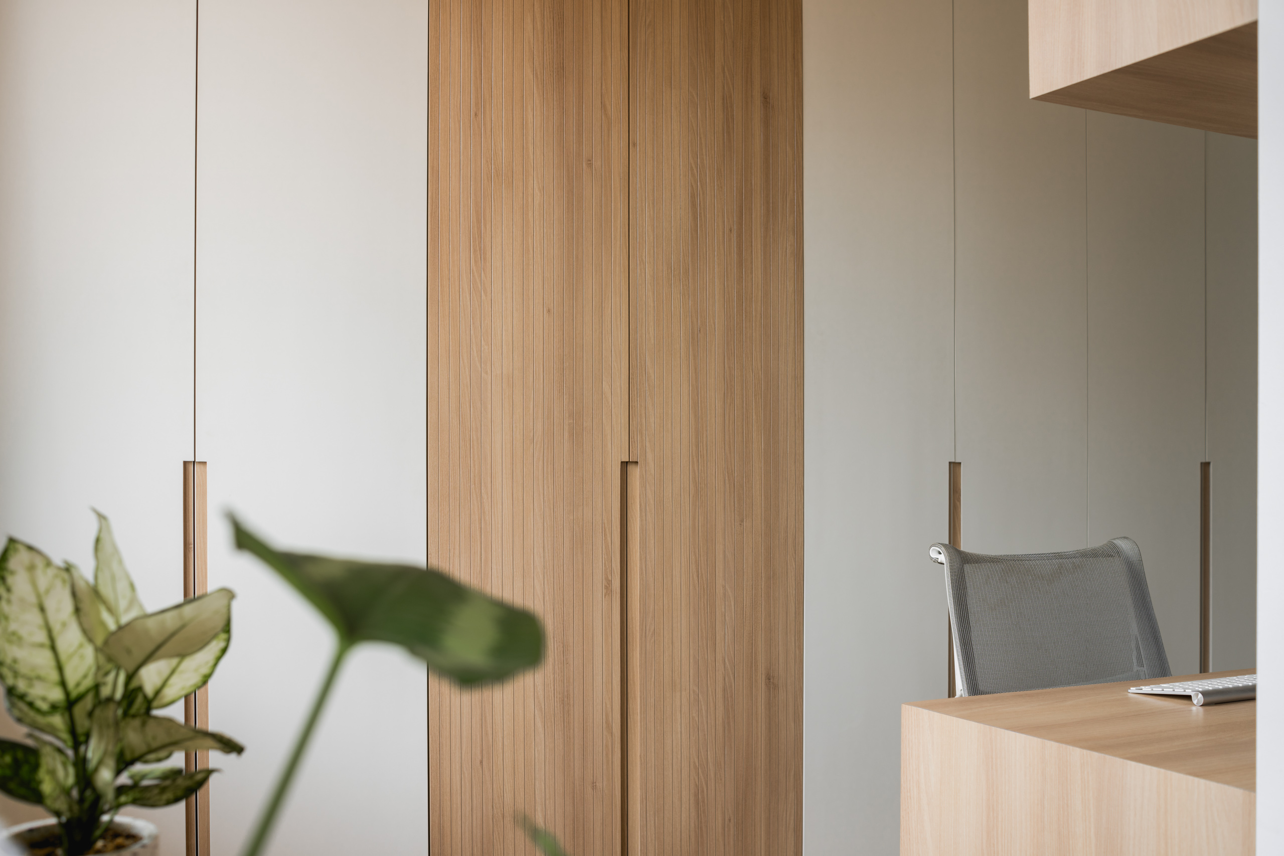
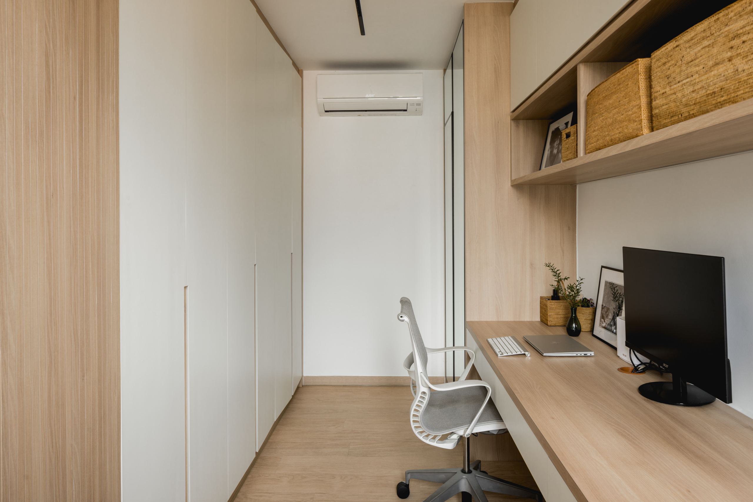
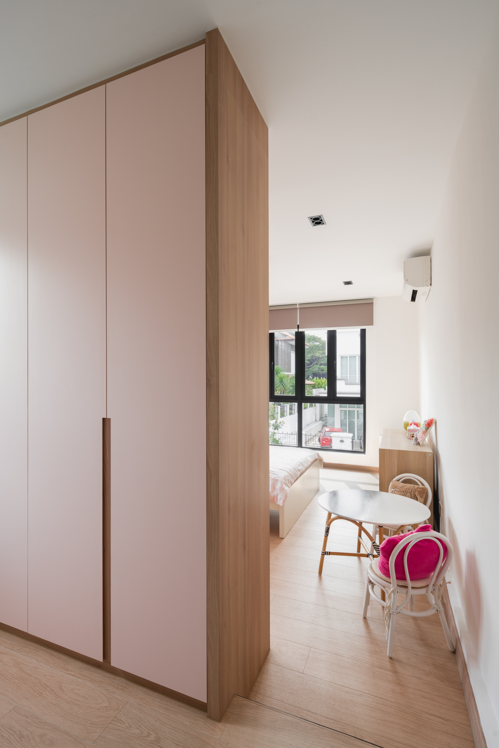
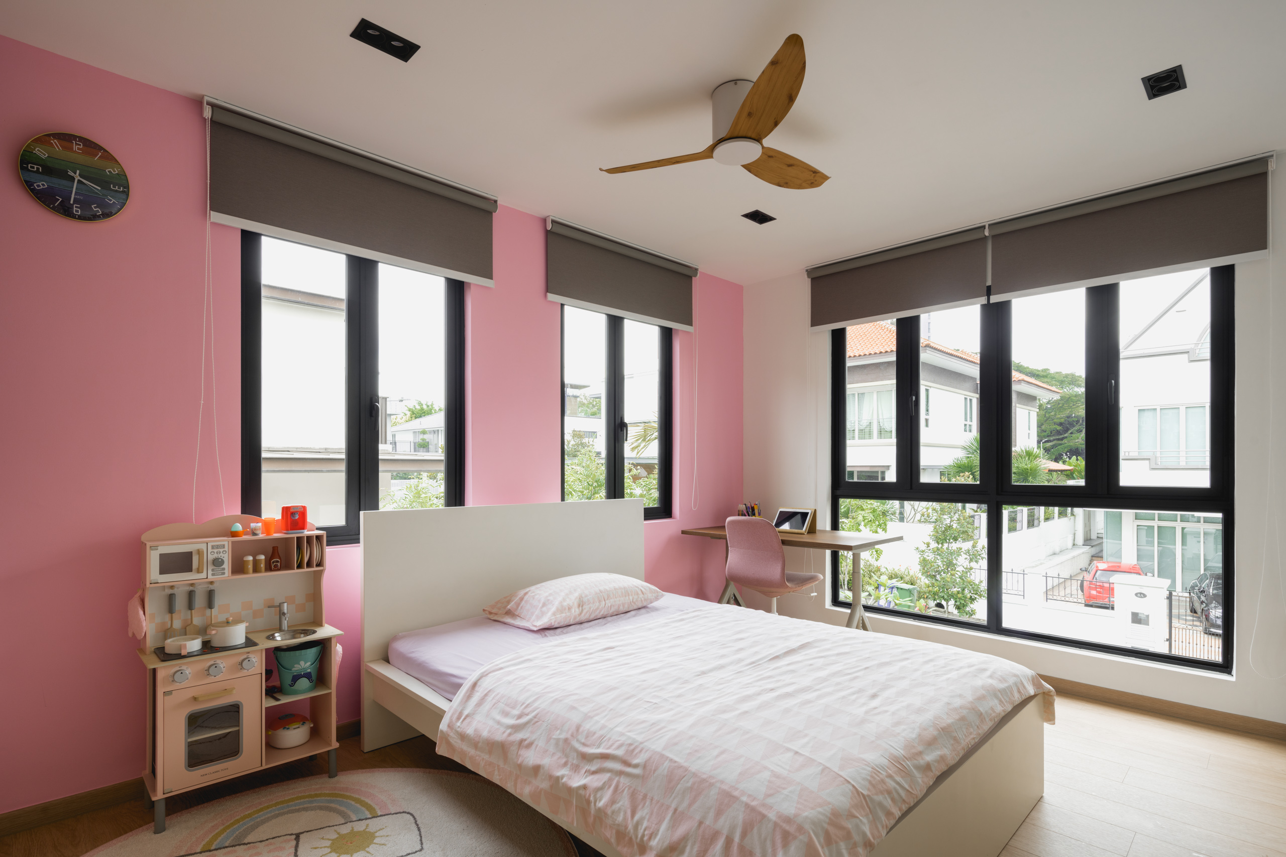
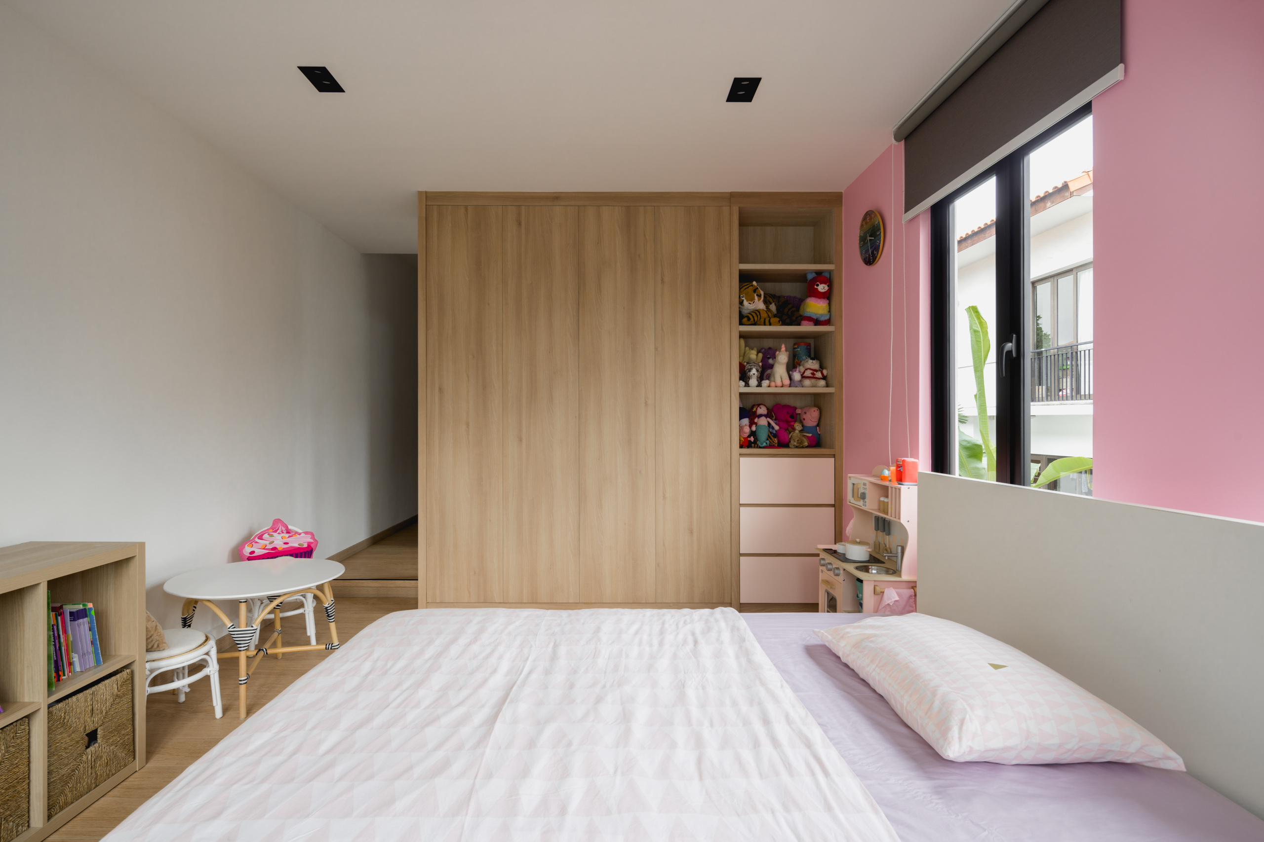
As plant enthusiasts, the homeowners were fond of the idea of blending the indoor and outdoor elements at the forefront of their home. They requested a combination of Scandinavian and Muji-inspired home interior – one where simplicity, functionality and a sense of wellness co-exist. The interior designer suggested creating a focal point at the foyer by having a large bay window seat, allowing plenty of sunlight to enter in the living room in addition to the landscape view. The open concept living can also be seen in the patio area where a bi-fold door was installed, allowing consistent air flow and sunlight radiating across the room. As a family who often hosts gatherings, the interior designer suggested an open concept for the dry kitchen and dining layout as a means to facilitate ease of interaction and flow of movement. To achieve this, the kitchen island and cabinetry were made parallel to one another. Another key aspect of the renovation was having two separate home offices – one in the master bedroom and the other on the first floor study room. A partition wall was built in the master bedroom to create zones specifically for a walk-in wardrobe and built-in work desk, essentially maximising the space in an organised fashion. Considering the generous amount of floor space in one of the kid’s bedrooms, a double-sided wardrobe was installed to cater for additional storage space on the second floor.


 BACK TO PROJECTS