HOUSE TOUR: The Beauty Of The Simple
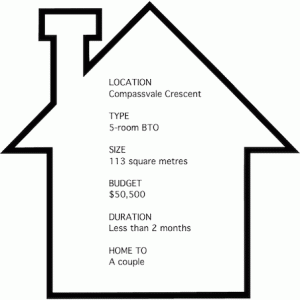
Homeowners Jasper and Angelina Seet had already seen a number of interior designers when they made an appointment with Nicky from The Interior Lab. After the meeting, they couple decided to engage her to do up their new BTO flat. “We eventually decided to go with Nicky because she was really sincere when we spoke to her. We liked that she didn’t insist on her designs or her ways, but catered to what we liked and wanted.”
The couple’s brief to their designer was simple:
A home that was clean and uncomplicated, with a hint of the Scandinavian style. Nicky took their brief to heart and got to work immediately, creating a home that was just what Jasper and Angelina envisioned, but better. “As new homeowners, there were a lot of things that we didn’t know. So we were glad that Nicky, using her vast experience, gave us plenty of suggestions.”
Like the design stage, the renovation process was a breeze. “Nicky was really on the ball,” shares Jasper of the renovation process. “She did a defects check on the day after we got out keys and the renovation work started the first week after.” During the renovation, the designer also provided regular updates every couple days, and visited the flat regularly to provide the pair with photo updates.
After less than two months, the home is a picture of minimalist beauty, laced with the warmth and gentleness of the Scandinavian style and cheery pops of mint.
Living Room
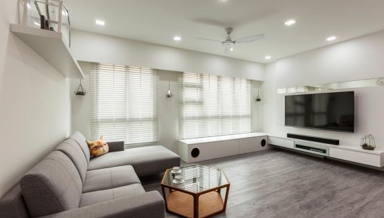
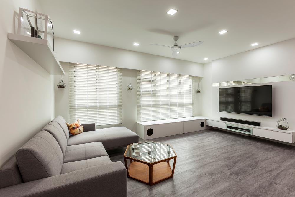
The communal space is minimalist and fuss-free, just like what the homeowners wanted. Built-ins were kept to a minimum while recessed lights were chosen to keep things looking neat and tidy in the ceiling. A predominately white palette and the woodgrain flooring evokes a Scandinavian aesthetic. The ‘floating’ TV console extends to a bay seat that doubles as a play area for their five cats (the two holes serve as entry points for the felines).
Open Kitchen
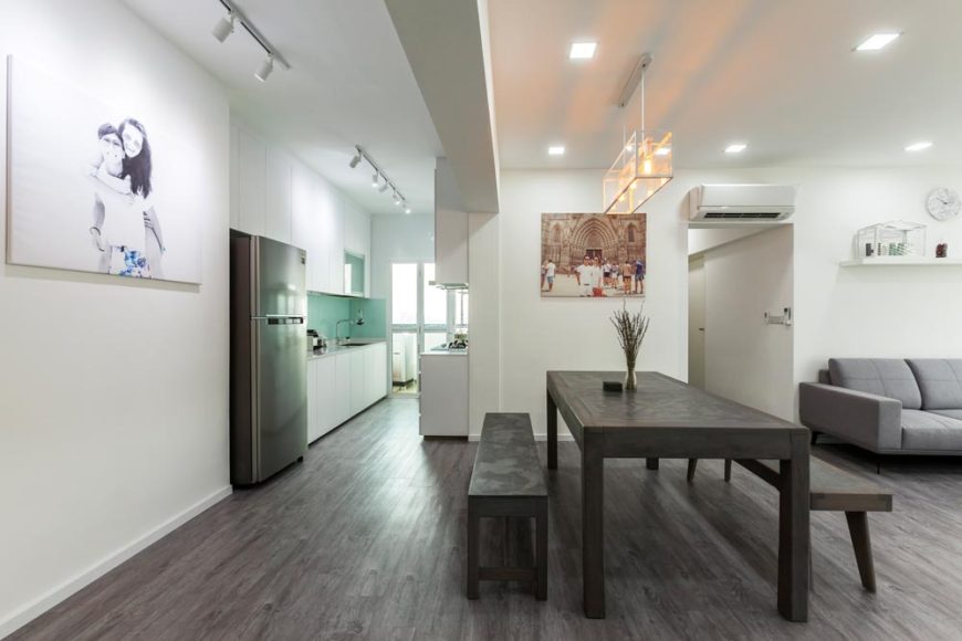
To facilitate hosting and dining, the Seets requested for an open concept kitchen. The original walls were hacked away, to reveal existing HDB tiles which Nicky then stripped away and smoothened over with cement screed. Light now enters every inch of the cooking area, creating a bright and open space. Thanks to the lack of barriers between the kitchen and the dining area, serving meals during dinnertime becomes a breeze.
Cooking Zone
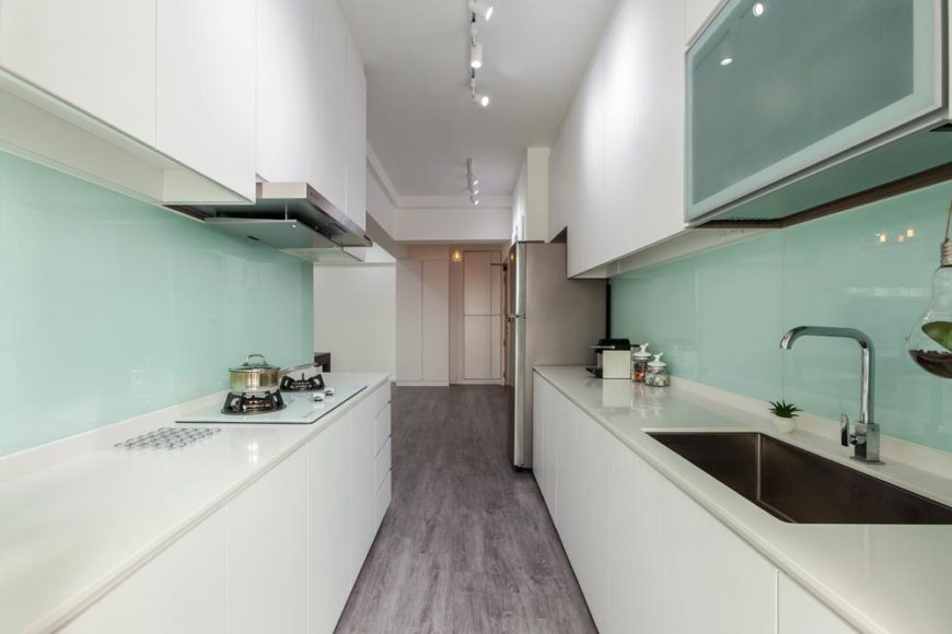
Despite the lack of square footage, the kitchen appears large thanks to the open plan that was accentuated with the choice of matte-white laminates for the kitchen cabinets and the white solid glass for the backsplash.
Bathroom
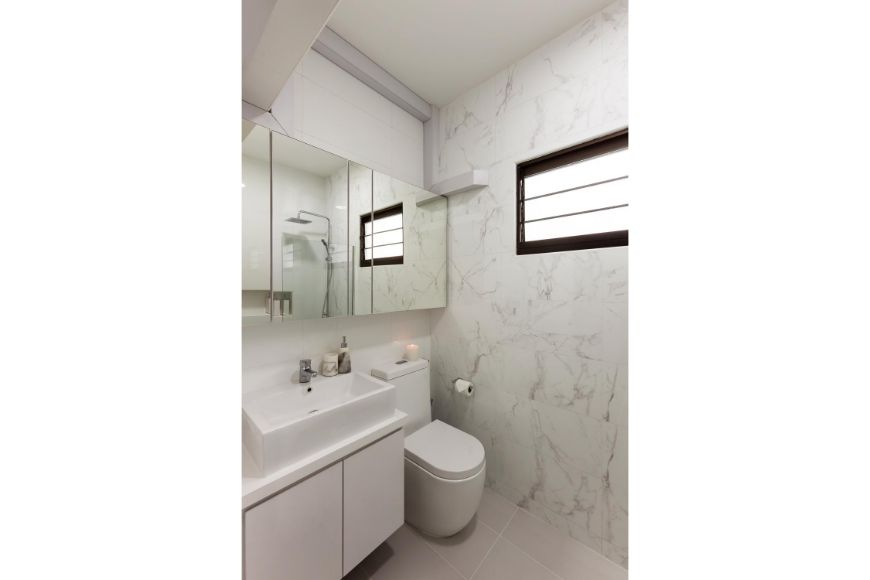
The common bathroom, just like the master en-suite, is inlaid with marble-lookalike tiles. Elegant and classy, the tiles help to elicit images of a luxurious hotel bathroom.
Master Bedroom
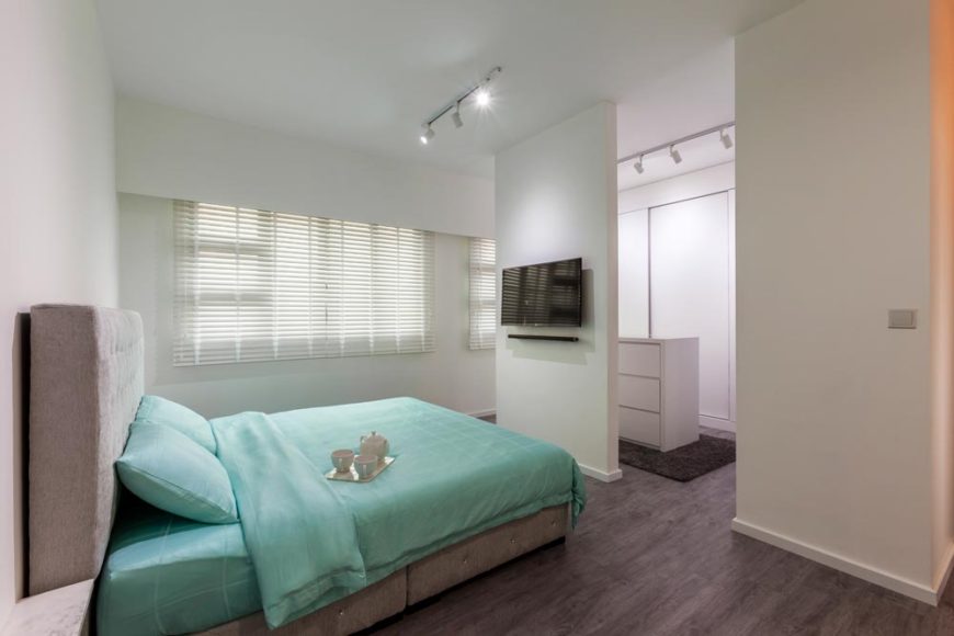
The walls between the master bedroom and the adjoining bedroom in this BTO were mostly knocked down in order to accommodate a walk-in wardrobe, leaving only a strip for a wall-mounted TV. Like the rest of the home, the sleeping quarters is kept simple with minimal furnishings and a clean colour scheme.
Walk-in Wardrobe
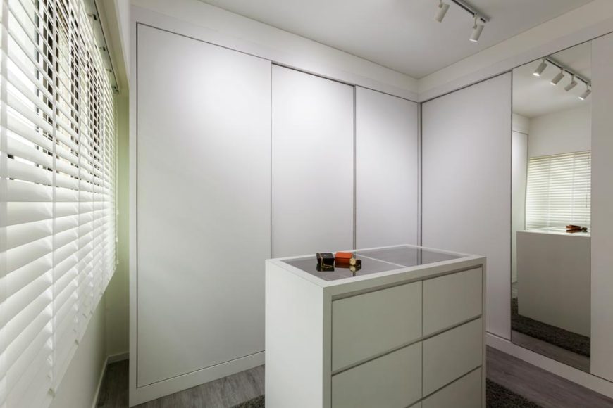
Handle-less, white cabinet doors were chosen for the closet in the walk-in wardrobe to give a seamless appearance. Nicky also created a jewellery drawer island with a clear glass display for Angelina to parade her fashion wares.
CONSULT OUR DESIGNER
- 11 April 2025 TIPS & GUIDES
Wet and Dry Kitchens in Singapore Homes: What Are They And Do You Need Both?
- 8 April 2025 TIPS & GUIDES
How to Mix Scandinavian & Asian Elements for a Unique Look
- 8 April 2025 TIPS & GUIDES
The Golden Ratio in Interior Design: Balance Your Singapore Home
- 8 April 2025 TIPS & GUIDES
Transform Your HDB with Modern Luxury Interior Design
- 8 April 2025 TIPS & GUIDES
How to Blend Traditional Elegance with Modern Luxury Design
- 28 March 2025 TIPS & GUIDES
Biophilic Interior Design: Beyond The Aesthetics


 BACK TO BLOG